Improve the mobile speed of your WordPress site

If you’ve ever run a PageSpeed or other speed test for the mobile version of your site, you’ve undoubtedly been horrified by the low speed and score compared to the desktop version of your site.
In this post I’ll explain:
- Why mobile performance is typically worse
- The primary cause of slow mobile pages
- How to create mobile-specific versions of your pages
- How to remove unnecessary files from your mobile pages
Optimizing for mobile does take a bit of extra effort since site owners are usually “retrofitting” their sites for mobile performance.
If you are starting a new site, it will be easier if you consider mobile performance from the start, and make it a priority.
Table of Contents
Why is my website slow on mobile?
First, rest assured that this is totally normal!
Mobile speeds and scores will be worse than desktop by default because:
- Google’s PageSpeed tool uses a slow 3G connection to run the test. This is very different than fast 4G or wi-fi. Slower connection speeds = slower loading experience
- Mobile devices generally have less processing power than a desktop computer, so it takes longer to process all the code on your page. Google uses a mid-range device for testing, which is slower than the fancy iPhone you might have.
Making a site fast under optimal conditions is very different than optimizing for poor conditions, like those of a PageSpeed mobile test. It takes extra work if you want to properly optimize your mobile site.
What site owners do wrong
Many site owners build their sites with desktop visitors in mind. They load their pages up with rich and resource-intensive content, like sliders etc.
These features may work OK on a desktop. But with the mobile limitations described above in mind, you can’t push that same content over a slow connection to a limited device and expect the same performance.
As Google continues to move toward mobile-first indexing, we have to build our sites accordingly. That means making sure the mobile experience is just as good as, or better than desktop.
We’ll need to make a mental shift to designing for mobile visitors first. Make the mobile version of your site as fast as possible and add the bells and whistles only for desktop visitors.
You might be costing your visitors time and money
Always keep in mind that not everyone has access to cheap internet and they may be paying a lot for bandwidth. So when you’re shoving a complicated 5MB page at them, not only are they suffering from a poor user experience because the page is slow and unresponsive, but you are literally making them pay money for this!
What slows down a mobile page?
I encourage you to read my guide about all the ways we, as site owners, slow down our pages. All the same things that slow down a page for desktop visitors, will slow down a mobile page, but the impact will be amplified on mobile.
The biggest issue is normally JavaScript which is used for interactive/dynamic features such as:
- Sliders
- Carousels
- Chat boxes
- Videos
- Widgets with social feeds (e.g. displaying Instagram pics)
- Animations and other effects
- Parallax effects
To get an idea of how heavily your site relies on JavaScript, do this experiment. Turn off JavaScript in your browser and view your website. See how much of it is still visible and usable.
Anything that is broken or not visible is relying on JavaScript and these are the potentially problematic features of your site.
If most of the content isn’t visible, or if the layout is broken, you’ve got problems.
How do I speed up my WordPress mobile site?
First you have to figure out what’s causing the most problems.
PageSpeed tells you which plugins are the bottleneck
When you run the report, pay special attention to these sections:
- Reduce the impact of third-party code
- Reduce JavaScript execution time
Expand them and you will find some of the biggest bottlenecks to performance.
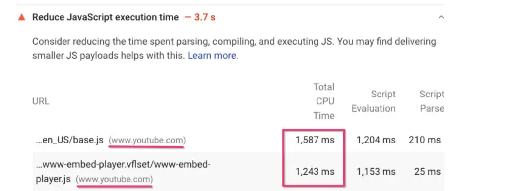
Third party culprits are typically easy to identify by the domain. When the file lives on your own domain, mouse over it to see which plugin is loading it.
Fine, what do I do about this pesky JavaScript stuff?
The best optimization technique is removal 🙂
So the first thing you have to do is audit all those features – do your mobile visitors really need them?
Another way to think about it is, can you afford them from a performance point of view?
There is going to be a trade-off so you have to decide if the benefit of the feature outweighs the impact it has on the speed.
If you decide it’s not crucial for your mobile visitors but ok for desktop visitors then you would ideally create a mobile-specific version of your pages.
How to create a different homepage for mobile visitors on your WordPress site
There are a range of plugins which allow you to create a separate version of your whole site for mobile, with a different theme etc.
But some pages on your site won’t need a mobile-specific version if they are not as resource intensive.
However, many sites that I see have a big problem with the homepage. That tends to get loaded up with sliders, tons of featured content etc.
So you may only need to create a lightweight version of one or two pages, not all of them.
Mobile Pages Plugin
The Mobile Pages plugin by Pootlepress lets you easily create a mobile-specific version of any page on your site.
The plugin will work best on sites built with Gutenberg. Some page builders probably won’t be compatible here, although many offer their own ways to create mobile-specific content.
To use the Mobile Pages plugin:
- Add a new block in your page
- Search for the Gutenberg Mobile block
- Click the Import Page Content button – this brings your existing content into the Gutenberg Mobile block.
- Now your page content has been divided between desktop and mobile and you can create a separate version just for mobile.
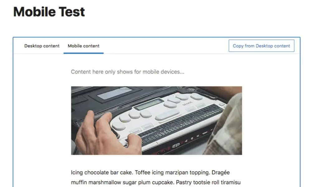
Keep the mobile content really simple and don’t load it up the same way you do your desktop version.
If you use a caching plugin make sure it can create a separate mobile version of the cache, otherwise the wrong version of the page could show up.
Remove unneeded files on mobile with Asset CleanUp Pro
Having created mobile-specific content, you may also want to go a step further and remove any unnecessary CSS and JS files from being loaded on mobile devices.
The Pro version of Asset CleanUp will let you control which files load according to media queries. That means you decide for which screen sizes the file should load. So if you don’t want it on the mobile version of your site, you would use something like this:
only screen and (min-width: 540px)
That means the file will only load when the screen size is at least 540px, therefore excluding mobile phones.
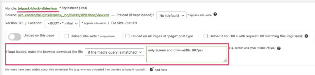
You can use a site like this one to find the screen sizes of common devices so you can choose your media query.
Demo
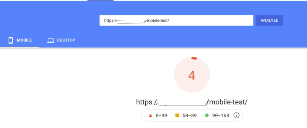
As a proof of concept, I made a test page with a slider at the top, then some text followed by a YouTube video. I have caching activated but no other optimizations. This page, with the same content for both, scores between 4 – 9 on mobile and around 55 on desktop (scores can vary slightly on each test).
Using the Mobile Pages plugin, I created a mobile version of the page where I replaced the slider with a single, static image.
And using Asset CleanUp Pro I removed the related files from the slider for mobile and a couple of other plugin files not needed for the page.
The mobile score went up to 22 – 28 just with those changes.
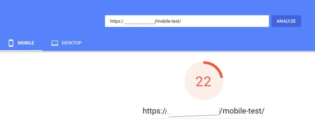
Of course, 22 is still pretty bad, but this is also before I’ve further optimized the page with all the usual techniques like LazyLoad, minification etc.
Just this simple change in content gained 18-24 points.
And to drive the point home a bit more, if we look at some specific PageSpeed metrics related to JavaScript, you can see great improvement there as well:
| Original content | Mobile-specific content | |
| Minimize main-thread work | 7.3s | 4.9s |
| Reduce JS execution time | 5.3s | 3.4s |
| Time to interactive | 20.5s | 11.9s |
If you can’t remove JavaScript, you must delay it
If you’re not willing to compromise on content then the next best thing you can do to improve the performance is to delay the execution of JavaScript.
You can do this with a plugin like WP Rocket or with Flying Scripts.
What this optimization does is delays loading and running JavaScript until the visitor interacts with the page, touches the screen or scrolls, for example.
Benefit: You get a faster initial page load. Any non-JavaScript content will display faster. JavaScript is hidden from PageSpeed so your score goes up.
Downside: If the visible part of your page requires JavaScript, and you delay it, the visitor won’t see anything until they interact. So in some cases this could provide a strange user experience.
Additionally while this technique improves PageSpeed, as soon as the visitor interacts with the page, all the heavy JavaScript is still going to load and cause whatever problems it always did for your actual visitor. So while PageSpeed might give you a green result, the user experience may still not be optimal.
As an example, if you have a lot of ads on your site, you can delay the script that launches them and it will greatly improve your PageSpeed score. But when a real visitor scrolls the page, the ads and all the many MBs of JavaScript that come with them, will still load and impact user experience at that point. That will still cost the visitor bandwidth, money, time etc.
Fundamental optimizations still apply
All the other standard optimizations like GZIP compression, minification, LazyLoad etc apply for mobile just as they will for desktop.
But if you really want to have a great performing mobile page, you will have to optimize the content too.
Conclusion
With both mobile-first indexing and Core Web Vitals becoming reality, now is the time to start working on the mobile performance of your site. Make it a priority, not an afterthought!