How to Fix “Avoid an Excessive DOM Size” in WordPress: A Practical Guide
The PageSpeed recommendation to “avoid an excessive DOM size” is a tricky one for WordPress site owners. There isn’t a plugin that can magically fix this for you. You, the site owner, will need to make some changes to your content.
Most of the articles you’ll find on this topic are going to go into the technical things to do which aren’t possible for non-developers. However, this guide is a practical one for WordPress site owners.
In this guide I will show you:
- How to identify what’s causing DOM size problems on your pages
- How to fix the problems.
If you’re trying to improve your PageSpeed score, also check out these other guides:
- Google PageSpeed Insights – A Guide for WordPress Users
- Reduce unused JavaScript in WordPress
- How to avoid enormous network payloads in WordPress
Table of Contents
We’ll start with a little bit of technical stuff, because you have to have some idea of what PageSpeed is talking about here. But then we’ll get into practical steps you can take to fix it and look at some real world examples.
What’s the DOM and why does it matter?
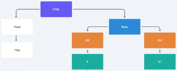
DOM stands for Document Object Model. This is a tree-like map that represents all of the elements of HTML code on your page. The browser uses this map to build the web page that we actually see.
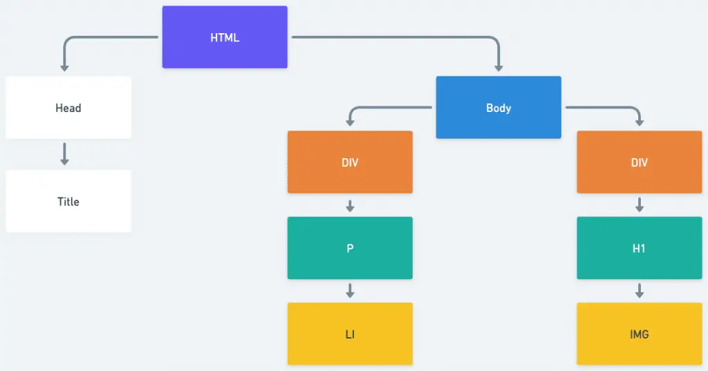
Every element, like an <img>, <div> or a <p> is a node in this structure.
If you’ve ever used “inspect element” in your browser, you’ve seen the DOM. The top half of the screenshot below shows a basic webpage. The lower half of the screenshot shows the Elements panel of the developer tools in Chrome and here we can see the DOM:
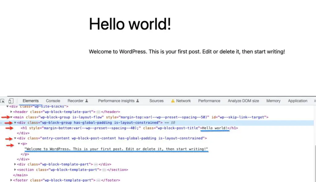
I’ve underlined the visible text in blue, and the 5 DOM elements that create it are indicated with red arrows.
This is a pretty simple structure, but later on we’ll see some complicated examples.
Whenever you add any content to your page, like a paragraph of text, or an image, it’s adding elements to the DOM. If your page was made only of basic text and simple images, DOM size probably wouldn’t be an issue.
Problems usually start to arise when more complicated features, like sliders for example, are added. Because these often require many DOM elements to contain the required code.
The more complicated and large the DOM structure is, the more intensive the processing the browser has to do to read and process it. That means it will take longer to show content to your visitor.
Therefore PageSpeed wants your page’s DOM to be a reasonable size, so that won’t slow down the page.
When does PageSpeed show the DOM size recommendation?
PageSpeed specifically checks the <body> element of your page.
It shows a warning when the <body> has more than 800 nodes/elements
It shows an error when there are more than 1,400 nodes/elements
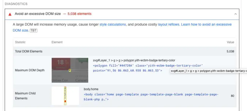
PageSpeed also gives you the following info:
Maximum DOM depth – this is the longest sequence of nested elements on the page, in other words the distance from a given element to the root element of the page.
Maximum child elements – this is the element that contains the highest number of child elements in the DOM, on the page
But, don’t get too caught up in those 2 numbers, they aren’t necessarily the most helpful in actually troubleshooting your page.
Reducing the overall number of elements is the goal.
What adds to the DOM size on WordPress sites?
Anything that adds code to your page can add to the DOM size. In WordPress this means:
- Your theme
- Your plugins
- Your content
Although you may not be writing the code directly, you do still have a lot of control over the DOM size with the choices you make, as we’ll see below.
How to find the biggest contributors to DOM size on your site
I recommend using the DOM Size Analyzer Chrome extension to help you find the sources of excessive DOM size.
- Add the extension to your browser.
- Navigate to the page on your site that you want to improve
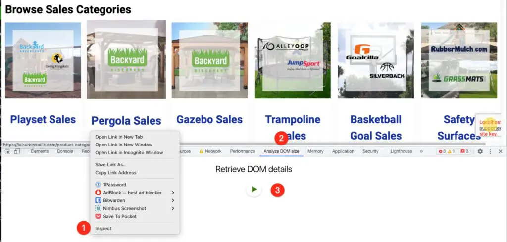
- Right click and choose Inspect
- Find the tab named Analyze DOM Size
- Click the Play button
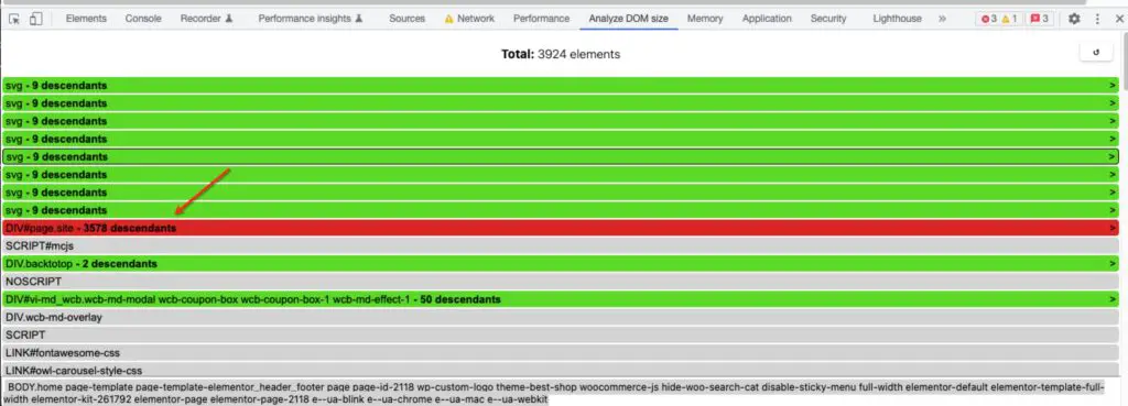
This analyzes the page and gives you the total number of DOM elements. Below that it displays the elements of the DOM tree, each with the number of nodes. - Since HTML is nested, you have to click into elements to find the sections that match your content.
Keep clicking on the element with the largest number until you get into more specific parts of the content
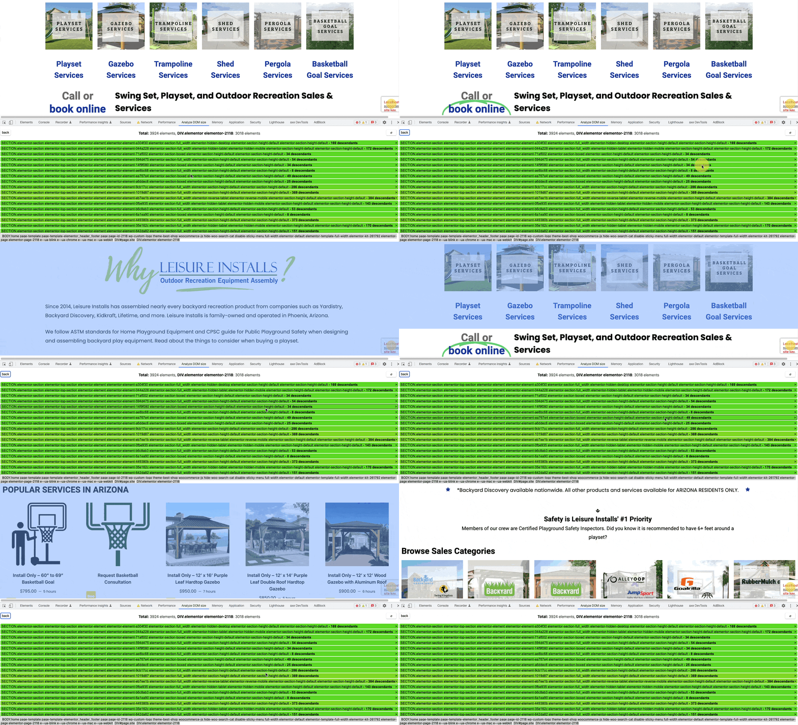
Find the row with the largest number of descendants: - As you click into elements, you will see that the corresponding part of the page becomes highlighted, as you mouse over them (see gif below)
- This will allow you to see exactly which parts of the page are contributing the most to the DOM bloat.
- Once you have that info you can either remove that element, or reduce its footprint: reduce the number of images, reduce number of featured items, reduce number of slides etc.
Practical tips and examples for site owners
Avoid page builders
Page builders like Elementor and WP Bakery are notorious for being inefficiently coded. They output messy HTML with tons of nested elements (sometimes referred to as “div soup”), often triggering the PageSpeed warning.
The goal of page builders is to make it easy for you build complicated pages, and maintaining best practices when trying to provide a huge number of easy-to-use features, is challenging.
Here’s an example:

This image looks simple enough. It’s not part of a slider or anything fancy, it’s just a basic image. It shouldn’t generate too many DOM elements normally.
But, when we check the DOM, look at the amount of nesting it takes to get to that image:
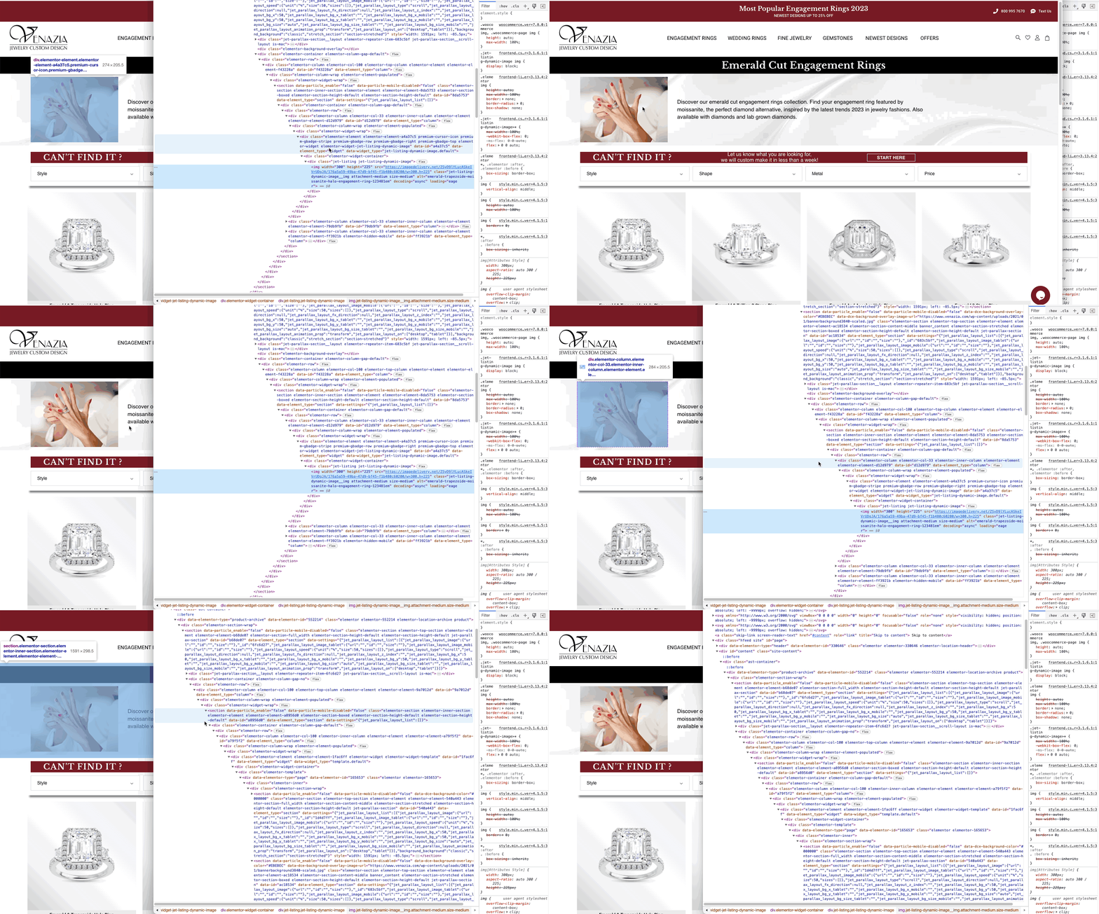
Even if you are not familiar with code, you can see the slope of the indentation in the code – the longer the slope, the more nested elements there are. That’s an example of overly complicated and bloated code.
This is because the site owner used an additional plugin and a parallax section to add basic image and text.
Takeaways:
- Always use the simplest method you can to build your pages.
- Switch to simpler themes like GeneratePress, Astra, etc.
- Avoid page builders
But your theme or page builder by itself is not the whole story.
Huge navigation menus, like mega menus, will add many more DOM elements.
A mega menu, or uber menu, looks like the example below. It generally contains many navigation links, usually organized in columns, and may also contain images and icons:

They may look nice and may seem like a good way to include many links to your content, but they come with a cost.
This UberMenu widget contains 450 DOM elements! That’s more than 50% of the “budget” for the whole page!
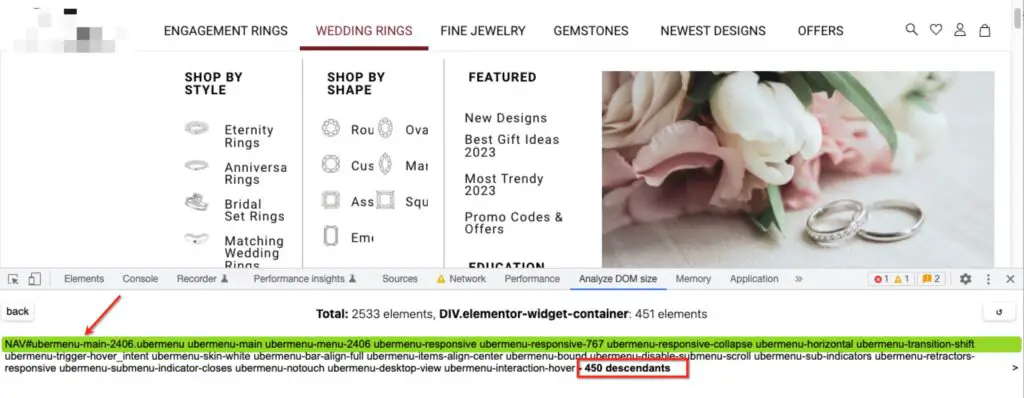
Even if you don’t use a mega menu, but you create many items with a lot of drop-downs, you will still be adding quite a lot of DOM elements.
Reduce rows of products and other featured items
Ecommerce sites are often amongst the worst offenders when it comes to DOM size. They tend to use many rows of featured products, which bloat the DOM.
This single product carousel has 353 elements:
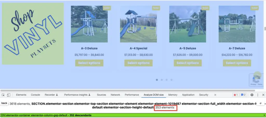
If that was the only one on the page, that might be OK.
But on this site there are multiple rows of product carousels:

So those hundreds of elements really add up!
This could apply to any type of row, it doesn’t have to be products specifically. It could be portfolio items, blog posts etc.
Use simple images instead of animated carousels or sliders.
This product row which is just images, has only 48 elements:
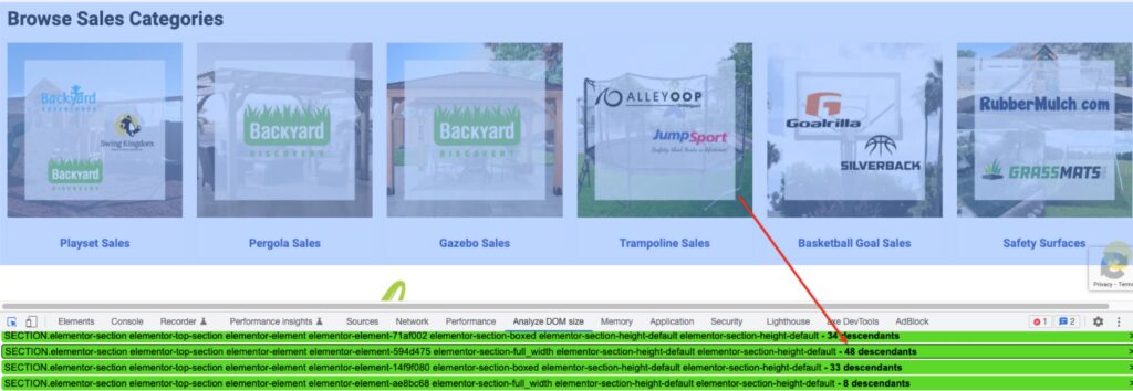
Takeaways
- Reduce the number of rows
- Reduce the number of products or items per row
- Use simple images instead of animated carousels
Don’t overuse tabs and accordions
Tabs, accordions, toggles – these are a good way to include more content on your page without the need for a lot of scrolling.
But you should be aware that even if your visitor doesn’t see all of the content at once, it’s still present in the DOM. So if each tab has a ton of content in it, this can still bloat the DOM.
In the example below, there’s 246 DOM elements hiding behind those tabs:
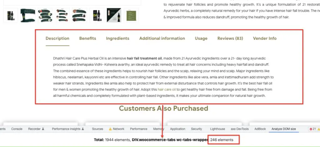
Don’t use CSS to hide content
Some themes and plugins will use CSS to hide content, for example to control which content shows on desktop vs. mobile.
This is a relatively easy and convenient way to handle different content for different devices, but the problem is that the “hidden” elements are still present in the DOM. So if you use this method too much, it could bloat the DOM too much.
For example, take a look at what Elementor does – it uses CSS to hide elements not intended for desktop:


Depending on how many elements each one has and how many hidden sections there are, that could contribute to the unnecessary size.
Streamline your pages
Whether or not your theme and plugins output messy or clean code, you will always make things worse if you load up your pages with tons of unnecessary content.
Some site owners throw a lot of content on the page, especially the homepage because they want to showcase everything they’ve got and they don’t make choices.
The longer your page is, the more content you add to it, the bigger the DOM size will be.
But this will only overwhelm your visitor.
Creating shorter, more focused pages will improve the DOM size and will also help your visitor.
Here are a few examples of content choices you can make, to reduce the DOM:
- Consider using simple, static images instead of sliders.
- If you must use a slider, don’t add a ton of images. 10 slides will add more DOM elements than 3 slides.
- Avoid adding multiple sliders or multiple interactive elements on the same page.
- If you have an image or video gallery, add the minimum number of items that you can.
- If you have a blog grid or list, limit the number of blog posts you’re showing and use pagination to display more.
- Avoid the temptation to use every fancy feature that your page builder or theme provides. Parallax elements, carousels, animations, toggles, galleries etc will increase the DOM more than basic content, so be mindful of what you add to your page.
WordPress Duotone SVGs
This is what I would call a micro-optimization.
WordPress adds some SVGs that are used for the Duotone filter feature:
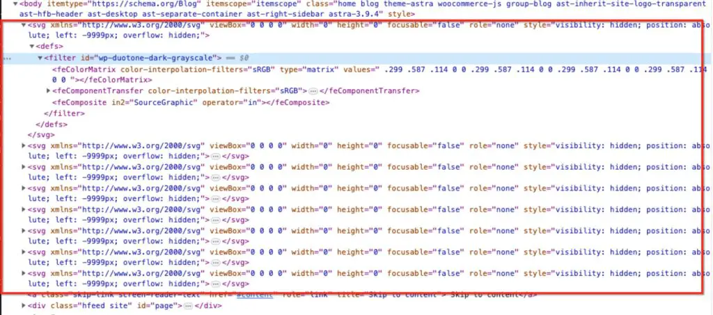
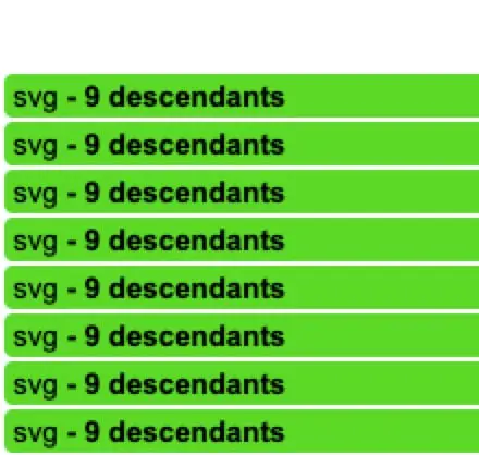
These amount to about 80 DOM elements. Not huge, and not your starting point if your DOM size is massive. But if you really want to fine tune, you could remove these.
Just be sure your site isn’t actually using these styles :)
These DOM elements can be removed using the “Remove Global Styles” feature in the Perfmatters plugin (affiliate link).
Technical tips for developers
If you are a developer and have access to the HTML of a site, or are building a theme, consider these recommendations.
Make CSS as concise as possible – don’t use inline styles.
Here you can see multiple inline styles – these nodes could be removed and the CSS added to one stylesheet, then also reused throughout the site.

Use modern CSS
- Using layout models like Flexbox or Grid will enable you to create more efficient layouts compared to using older methods like tables or floating divs.
- Use CSS Pseudo-elements**:
::beforeand::aftercan be used to add decorative elements without adding extra DOM elements.
Use content-visibility
Above I showed the example of CSS display:none being used to hide elements for mobile and desktop.
Consider using content-visibility instead. Using a value of hidden is similar to display:none
And using auto will provide a kind of “lazy load” for HTML elements. WordPress plugins like LiteSpeed Cache and FlyingPress offer this so-called lazy rendering of HTML elements by using content-visibility.
When searching for ways to reduce the DOM size, you may come across some articles which claim that lazy rendering HTML does this. It does not.
The DOM elements are still present in the page, so the DOM size is not reduced. But it does improve the render time, thereby offsetting the performance issues of a large DOM.
So you may still see the warning in PageSpeed, but the loading metrics should be better.
Use clean, semantic HTML
When you use the correct HTML tags as they are intended, your code will be leaner and reduce the need for additional elements.
In this example you can see that each line item is its own list.
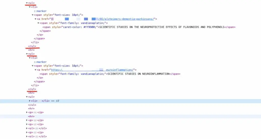
Instead of making one list with several sub-items, this would have been more efficient and reduced the number of elements.
Minimize the use of JavaScript
There are tons of performance issues with JavaScript.
As far as DOM size goes, JavaScript can be problematic because it can add a lot of DOM elements. So if you can implement a feature in CSS instead of JavaScript, do that!


