WordPress 3.1 Released – New Features
WordPress 3.1 was just released. Here are the highlights according to the WordPress site, along with some commentary by your truly ;)
Highlights
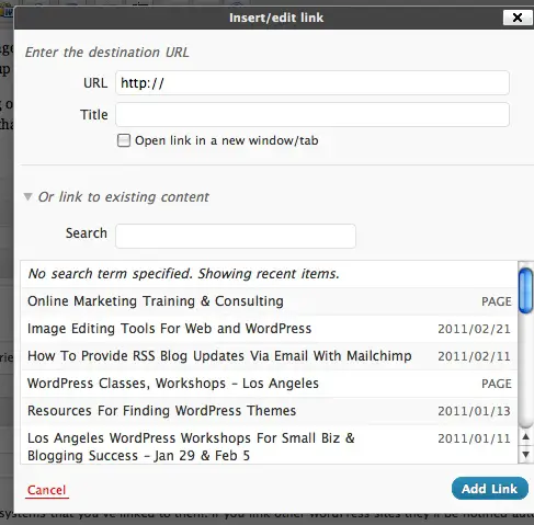
- Internal Linking – click a button for an internal link and it allows you to search for a post or browse a list of existing content and select it for inclusion.
Here’s how the new ‘add link’ box looks:
This is a really handy feature – it makes internal linking to your other posts and content much easier. Internal linking is helpful to guide your readers to more of your content, and good for SEO!
- Admin Bar – contains various links to useful admin screens. By default, the admin bar is displayed when a user is logged in and visiting the site and is not displayed in admin screens for single blog installs. For multisite installs, the admin bar is displayed both when visiting the site and in the admin screens.
The admin bar is a grey toolbar that shows up at the top of your site (click image above for larger view). If you use WordPress.com, you will be used to this. I actually find this really annoying to have at the top of my site when I’m logged in. If you go to Your Profile under Users, you can turn it off:
If you have multiple authors on your site and just want to make it disappear entirely, Yoast has the answer.
- Streamlined Writing Interface – new users of WordPress will find the write screen much less cluttered than before, as more of the options are hidden by default. You can click on Screen Options in the top right to bring them back.
In my particular installtion, the post editing screen looked the same as it always did. But if you are missing something you’re used to seeing, click on Screen Options at the top, and there should be a checkbox for it:
I did notice some things missing from my Page edit screen such as Revisions and a couple of others, which I could choose to show using the above method. Although they are trying to make the screen more streamlined, I wonder how many people will just now be unaware of certain features if they are new to WordPress and don’t know to click Screen Options? Not sure how I feel about this. It doesn’t actually make the process of posting content any faster or better, so to me, there’s no real benefit.
- Post Formats – meta information that can be used by themes to customize presentation of a post. Read more in the article Post Formats.
This is not something you will immediately notice as regular user. This is for theme developers – they have some new tools to play with, so you’ll start to see perhaps some different looking themes popping up, and especially those with Tumblr-like functionality. These types of changes do make WordPress more powerful as a CMS (Content Management System).
- Network Admin – move Super Admin menus and related pages out of the regular admin and into a new Network Admin screen.
- List-type Admin Screens – sortable columns for list-type screens and better pagination.
- Exporter/Importer Overhaul – many under the hood changes including adding author information, better handling for taxonomies and terms, and proper support for navigation menus.
- Custom Content Type Improvements – allows developers to generate archive pages, and have better menu and capability controls. Read more in the article Post Types.
- Advanced Queries – allows developers to query multiple taxonomies and custom fields.
- Refreshed Blue Admin Color Scheme – puts the focus more squarely on your content.
This post lists what WordPress considers to be the highlights. If you are a developer, or just want the full gory details, you can read the full details here. If you plan on upgrading your current WordPress installation to 3.1 – don’t forget to backup first!
If you have any further observations or comments on the new release – leave them in the comments.


Thanks for posting this Lucy. We just updated to 3.1 today and, of course, the first thing I had to do was get rid of that admin bar across the top.
I know – so annoying right?!