WordPress Image Positioning, Spacing & Alignment – Common Problems and Fixes
Table of Contents
They cause so much grief in the WordPress editor don’t they? They just don’t seem to do what you expect of them. Unfortunately the WordPress editor is not a drag n’ drop interface which is how people generally expect it to work.
With the release of WordPress 5.0, the content editing experience has been revamped with the “Gutenberg” block editor. So it’s time to revamp this post. Gutenberg is not completely drag n’ drop, but it is a more visual way of creating content. Some parts of it make your life a lot easier, but not all issues are resolved.
If you haven’t yet upgraded to WordPress 5+, the Classic Editor section of this post is for you.
WordPress 5+ : the Gutenberg Block Editor
A quick note about my setup. In these demos and screenshots, I use Gutenberg with the Top Toolbar option activated. This puts the controls for each block in the toolbar at the top of the page instead of hovering over each block, which I find a bit annoying.
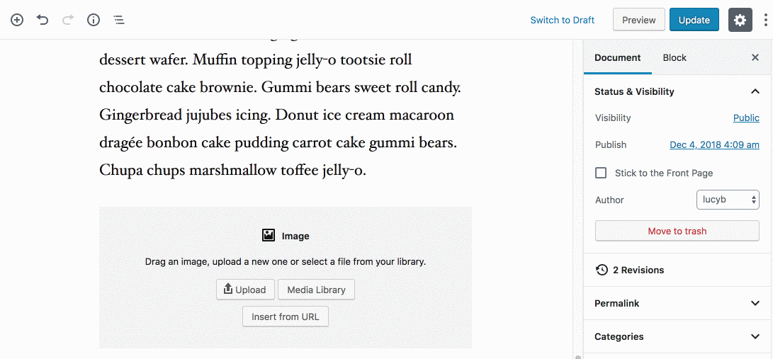
Insert an image
Let’s start with the basics of inserting an image.
As with everything in the new editor, images are now added using their own block. Whereas before you would have inserted an image directly into a paragraph of text, now your paragraph will be one discrete block and your image will be another block.
In this example I have a couple of paragraphs of text and I want to add an image between them.
Click the +, either in the top toolbar on between blocks. Then insert an image block.

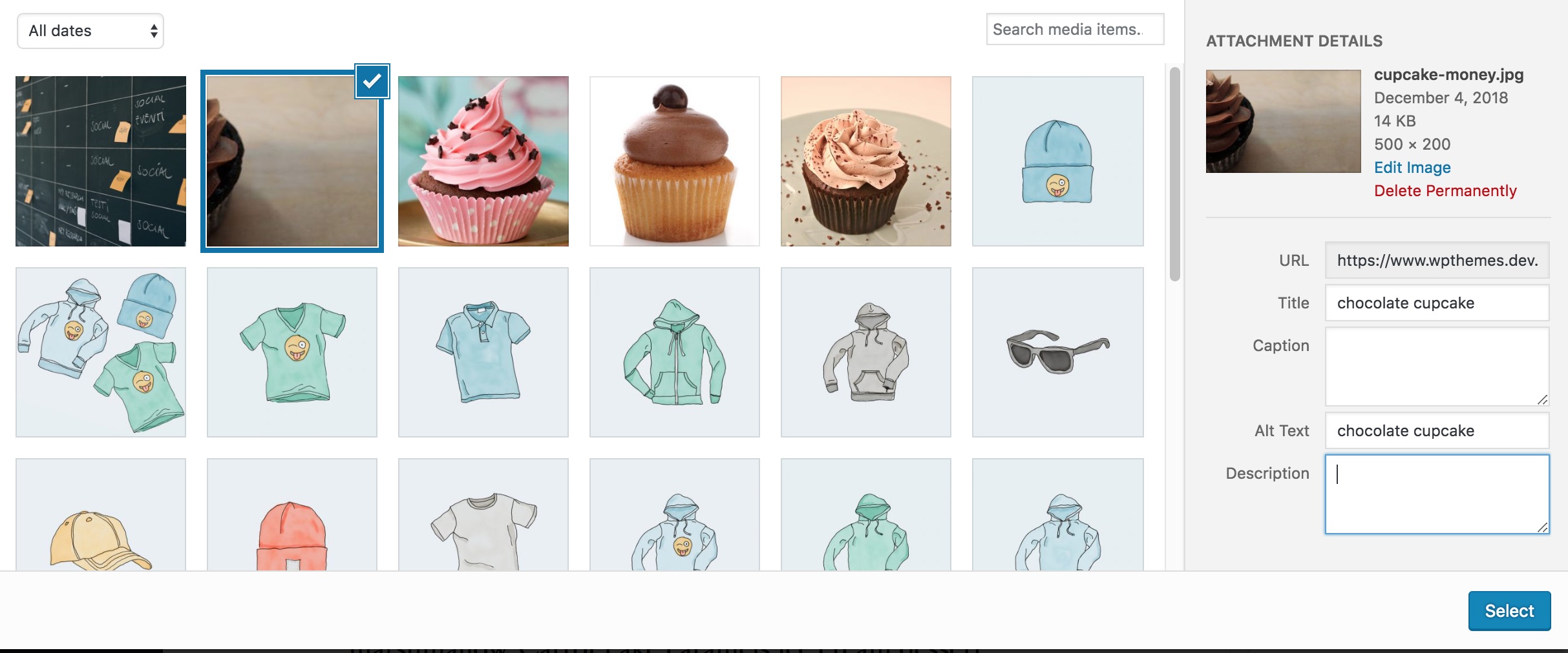
You can then choose to Upload, insert from URL, or choose from the media library. The latter option brings up a familiar modal media library window. The insertion process is familiar but you may notice you have fewer options in the attachment details column. These will be surfaced elsewhere in the Gutenberg interface.
The default insertion size seems to be large size (as defined by your theme), or full if large doesn’t exist, with no alignment.
In order to set the alternate text and size, you’ll use the Block settings on the right side. However, alignment is found in the toolbar. (I don’t know why these controls are in separate places.)

By default, blocks in Gutenberg simply stack in a vertical fashion. So immediately upon insertion, the text is above and below the image, each in their own block.
What do the alignment options do?
In many cases you’ll want the image to be in the flow of text, with text wrapped around it. While Gutenberg is supposed to be a more true to life What You See Is What You Get experience, it’s not perfect, so you should still consider what you see in the post editor to be an approximation and double-check using the Preview.
Generally speaking, the alignment options work as you would expect.
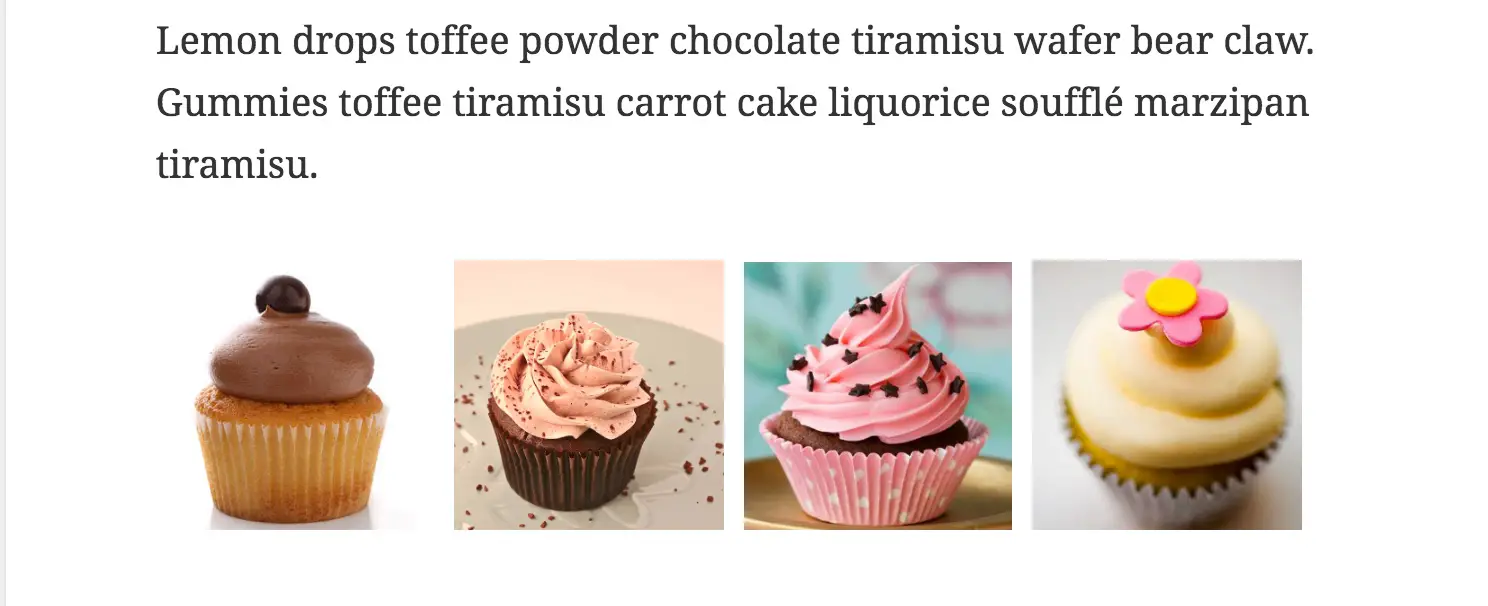
Here’s the image I selected with left alignment.
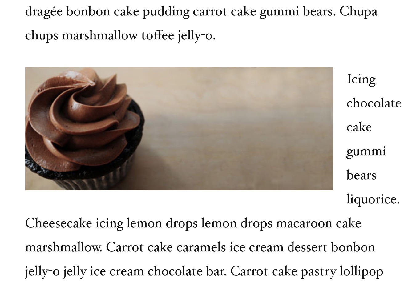
The text now wraps to the right of the image. Since the image is wide and takes up almost the full width of the content area, it of course doesn’t look very good wrapped. If I want it to wrap, I should use a smaller image.
Editing An Image After It Is In Your Post
Once you’ve added an image block, you can resize the image in a variety of ways:
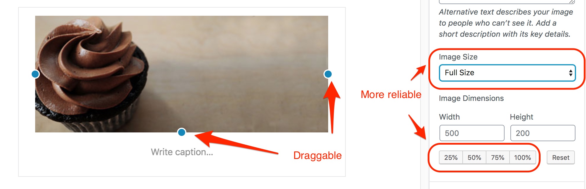
- Drag the blue dots to resize – it will stay in proportion
- Use the preset Image Size dropdown – these are the sizes provided by your theme and plugins
- Manually enter image dimensions
- Percentage resizer
There are some buggy parts of methods #1 and #3, (as of WP 5.0.2) , but I see a lot of related discussion on Github so it looks like it will be worked on. For more reliability, I would currently suggest using the image size dropdown or the percentage options.
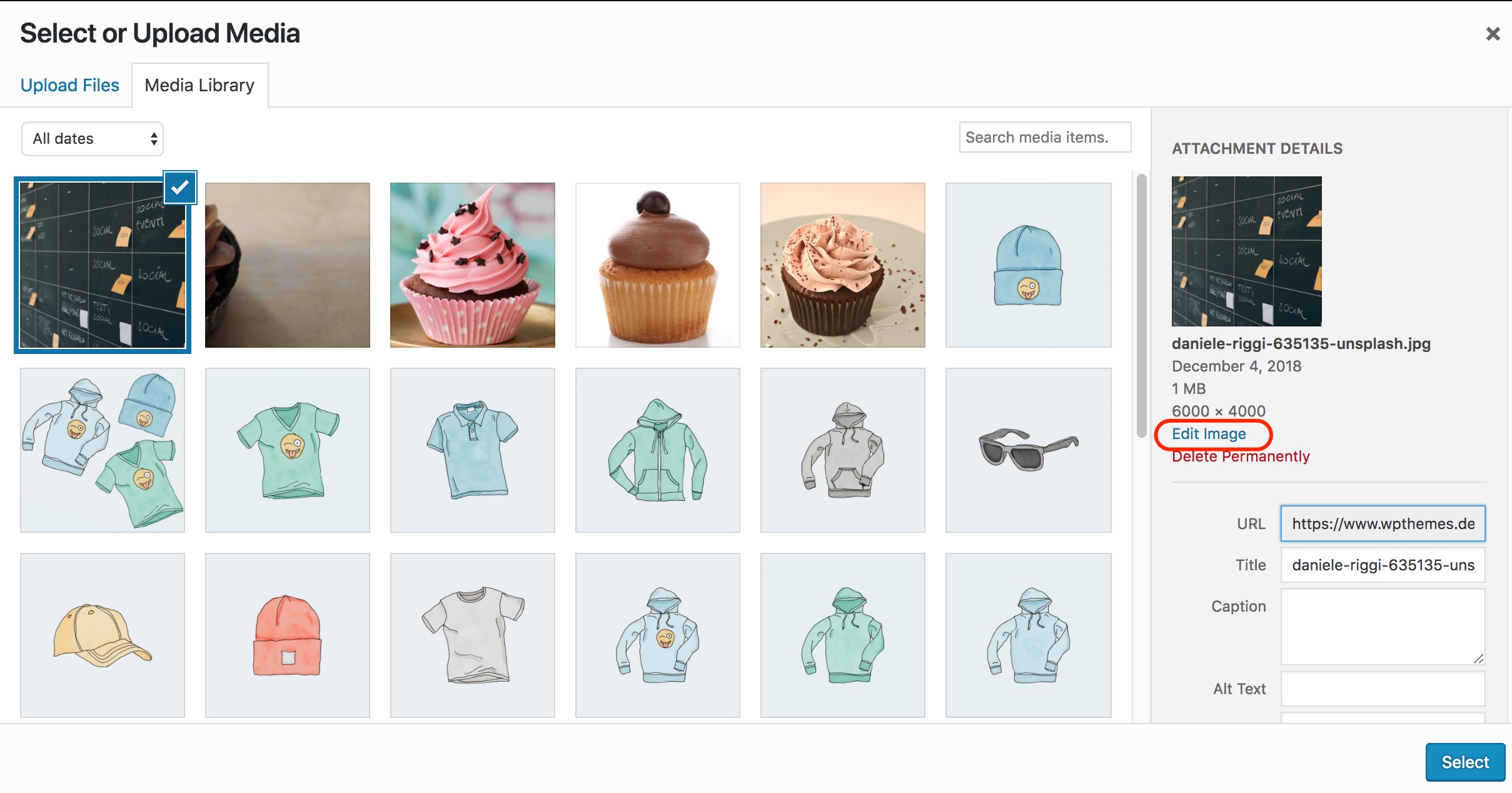
If you want to do more advanced edits like cropping or rotating, you still have access to the original media editor.
Clicking the pencil icon brings up the Media Library modal for that image.

You can click Edit Image to get into the familiar Edit Media screen where you can make edits such as cropping, scaling etc.
Alignment can still be tricky
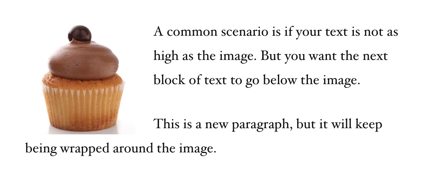
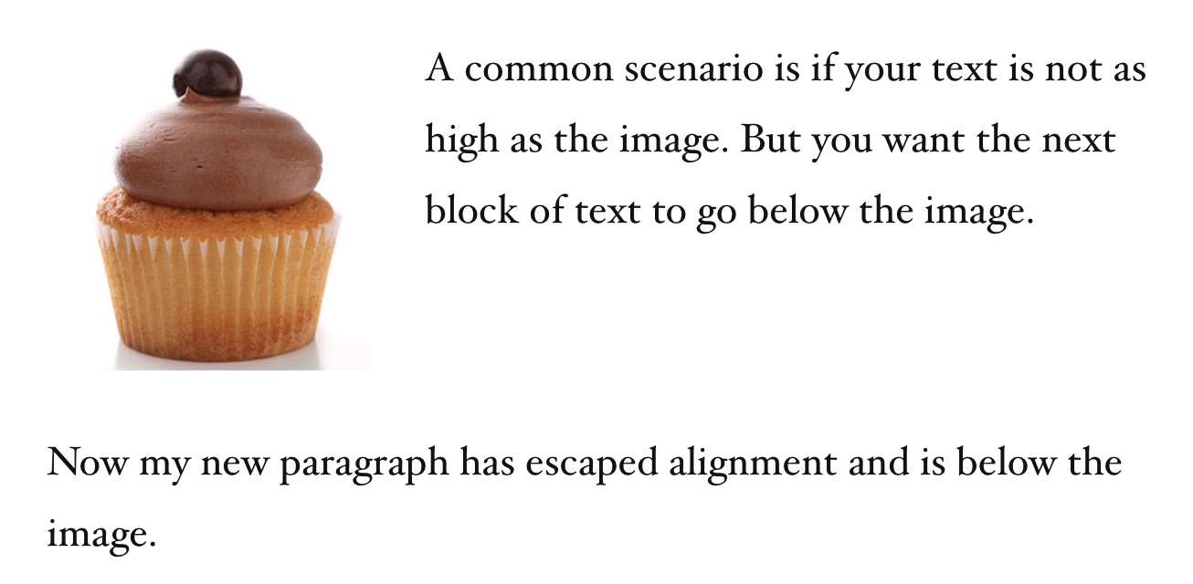
A familiar problem that has existed forever in the classic editor, is that of escaping the alignment. Meaning, you insert an image, align it, and then everything else after it also has the alignment applied, sucking it up around the image.
What if you only want a small piece of text aligned next to your image, and you want your next piece of content below the image? This is what I call escaping, or clearing the alignment, and it’s still an issue currently in Gutenberg.
Hitting enter a couple of times to create empty paragraphs looks like it should work, (you’ll see empty paragraph blocks in the editor), but it doesn’t. The empty blocks are ignored on the front end.
In the original version of this post, the Classic Editor section below, I recommended a plugin called Spacer to fix this problem.
Well, Gutenberg has a block called Spacer you can use. Insert this and then fiddle with the pixel number to get the amount of space you need.
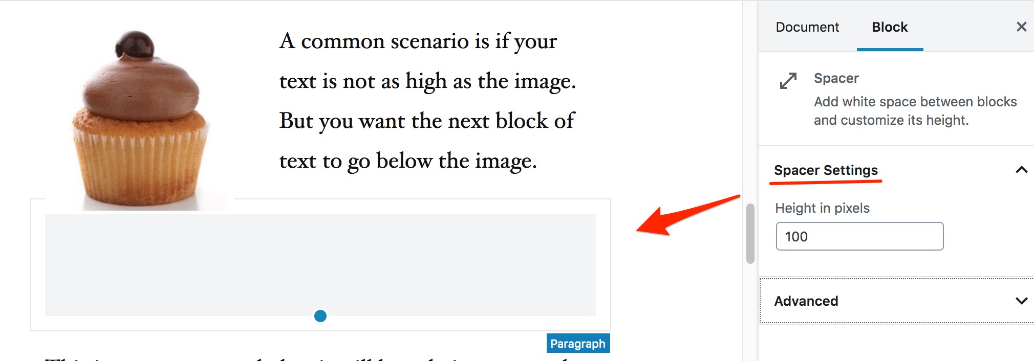
It’s quite simple to use but there is a downside: responsiveness, or lack thereof. This method doesn’t play well on mobile devices because the block is using a fixed pixel measurement, instead of a relative measurement which can scale.
So it looks great on my laptop:
But on mobile there’s more space than I would like:
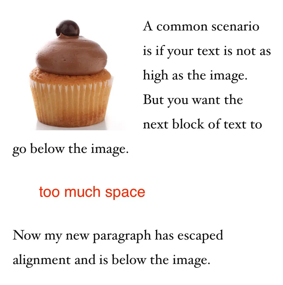
I only added 35 pixels of space here. The more you have to add on desktop, the worse it will be on mobile.
This has been a topic of discussion for a while on the Gutenberg Github. I’ve personally tried to add my voice to this issue, but it’s been shut down for now, supposedly until a good solution can be found:
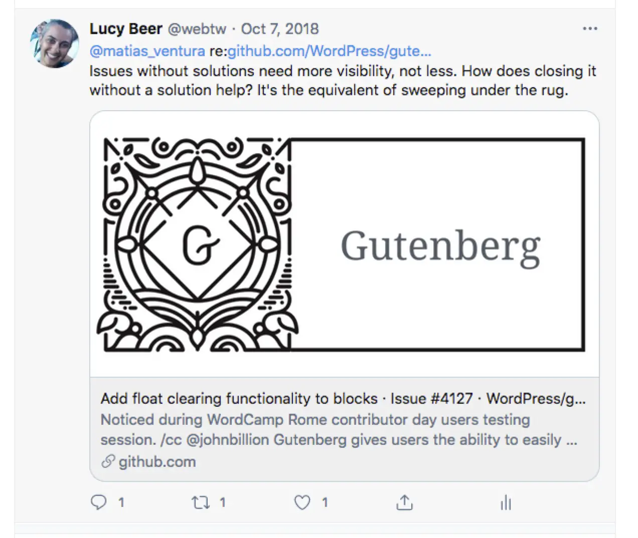
So there’s still not a good solution for this common problem, even in 5.6.
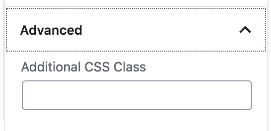
If you’re a developer and handy with CSS, you could use the CSS class field to add a custom class with the necessary styles to clear the float.
New alignment options
In addition to the typical left, right and center alignment options, Gutenberg introduces the possibility of 2 more: wide width and full width.
These have to be enabled and supported by your theme, so if you don’t see these options, your theme hasn’t added them.
The exact width of wide width will be defined by your theme; essentially it will be wider than the content area, but not full width:

Full width will span the full width of the screen.
These options provide a nice way to break out of the constraints of the content area.
Multiple Images on One Line
In Gutenberg you can no longer do the trick where you select multiple images and insert them at once. But there are other ways to add multiple images in a row:
- Use a Gallery block
- Use a Columns block, each with an image block inside
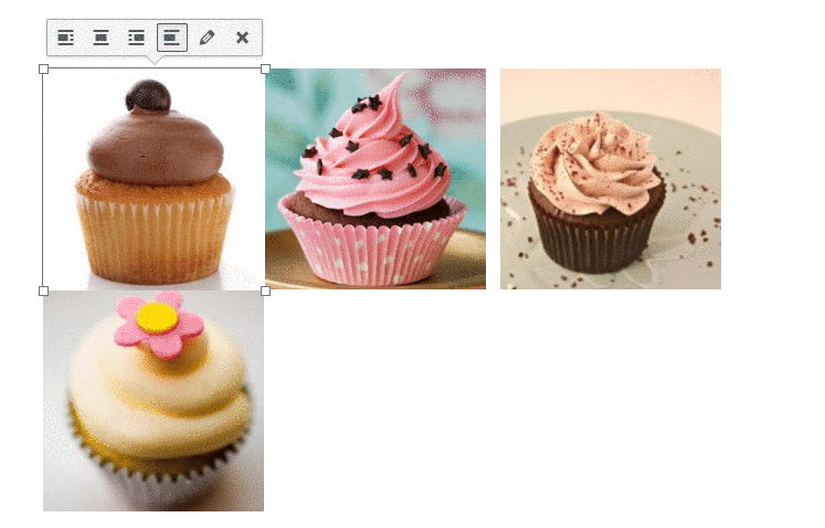
Gallery block
The interface of the Gallery block is very similar to the Image block, but it allows you to select as many images as you’d like.
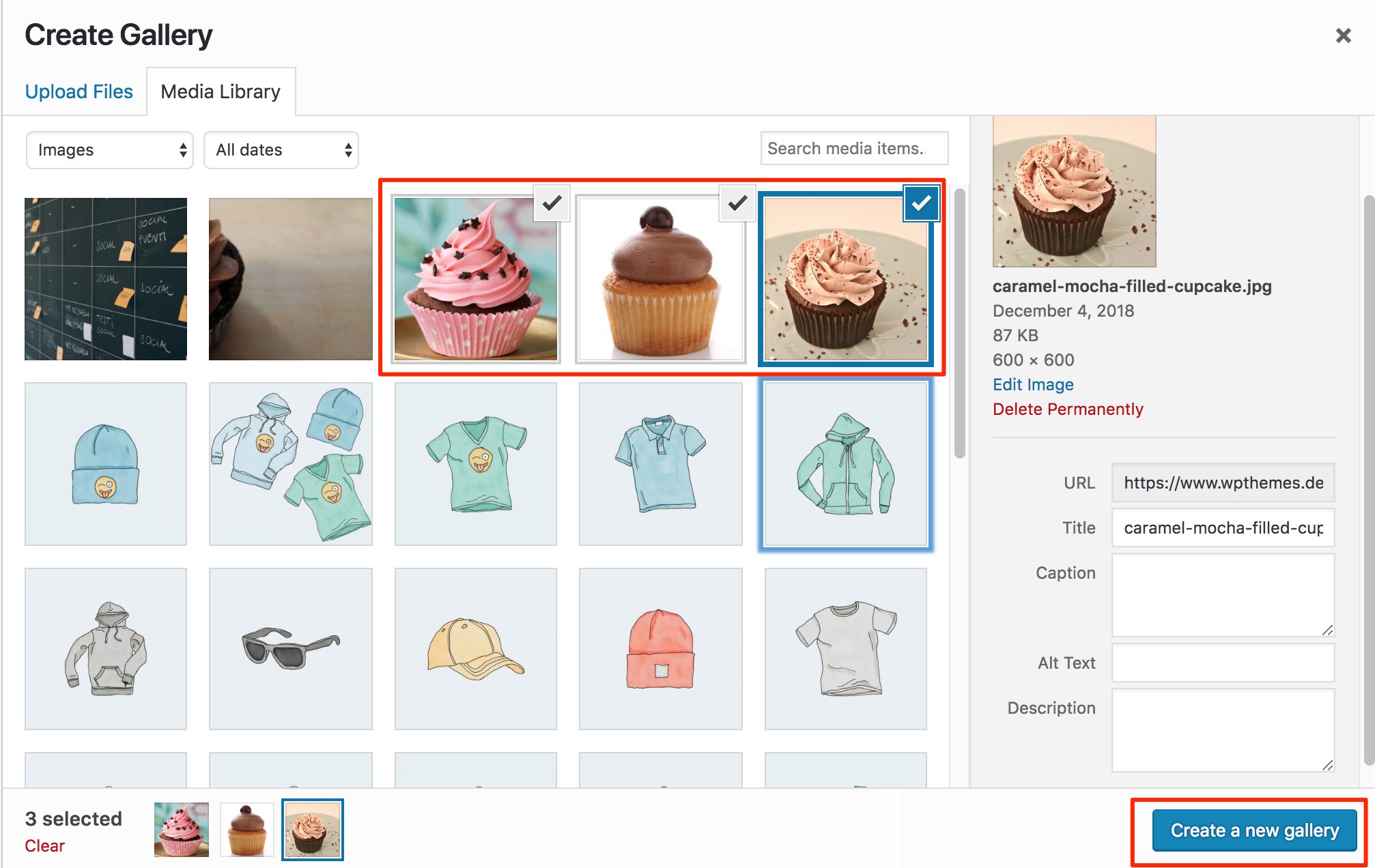
After selecting the images and clicking Create a new gallery, you’ll be on the Edit gallery screen. Here you can specify the order of the images and caption them.
In the Gallery block settings you can choose how many columns to arrange the image in, and whether or not to crop the thumbnails to make the images uniformly sized.
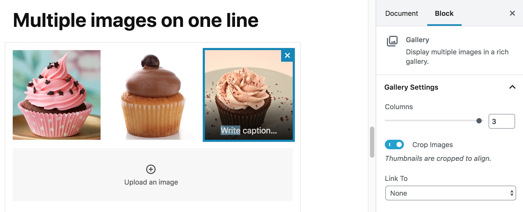
Images in the galley will always fill the width of the content area automatically.
The drawback of the Gallery block is the link settings. You cannot currently link each image in the gallery to a custom url. You can only choose between the media file or attachment page. If you want to have more control over this, or the sizes of the images, I’d recommend the Columns method instead.
No more faking columns
A great thing about Gutenberg is that we have real columns now and we don’t have to fake them. This makes it much easier to create more interesting layouts.
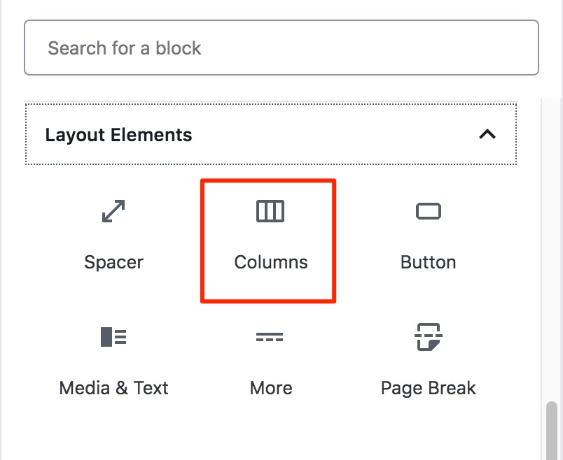
To use images with the Columns block, first add a Columns block, which is found under Layout Elements.
Columns uses what’s been dubbed “Nested Blocks”. That means you can add other blocks within the Columns block. In this example we’re focused on images, but you can use any other kind of content in your columns.
It’s a handy feature – the only finicky part is being able to select the Columns block to edit the settings, vs. selecting the blocks within it. Using the mouse to hover over will normally end up selecting the nested block. The trick is to select the block above, then use the down arrow key on your keyboard to move down to the Columns block.
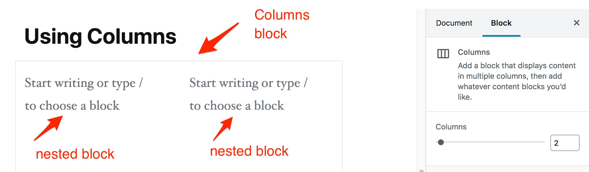
The columns block settings on the right enables you to add or remove columns. Currently they are equally divided across the space available.
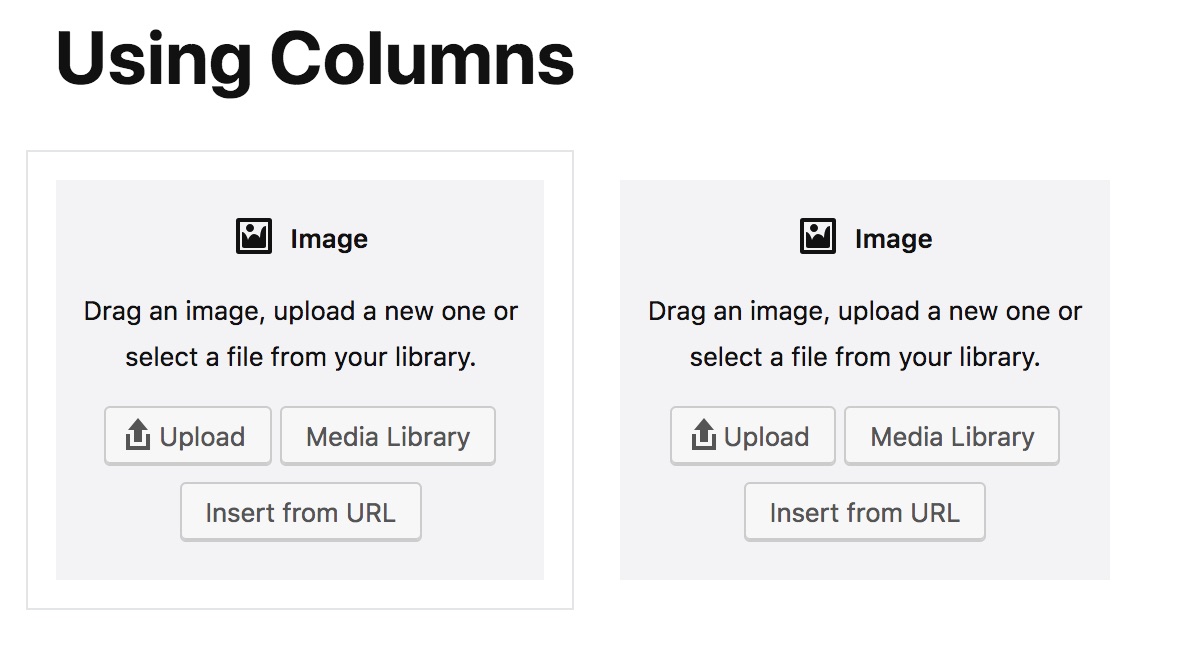
Then just click within each column to add an image block in each:
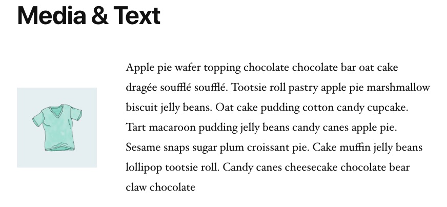
Media & Text block
This block is similar to using columns but has a couple of different features that could be useful in specific cases. The basic block sets up a media element next to a text block. The default is the image on the left and text on the right, but you can flip that in the settings:

If your theme supports the wide and full alignment options, you can apply those to this block.
The two differences between using this and the Columns block are:
1) The Media & Text block auto-adjusts the width of each column based on the image size. So, the smaller the image, the wider the text column will be and vice versa:
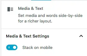
2) The Media & Text block gives an option to stack the columns on mobile, or not:
Other image blocks in Gutenberg
Cover block
This block enables you to put text over an image, which was previously impossible to do in the classic editor (without additional plugins).

It has the following features:
- Hyperlink and align the text
- The background image can be fixed for a parallax-y effect
- Set opacity and overlay color
Inline image block
You may be asking, what’s the difference between an inline image block and a regular image block?
Good question.
As I mentioned at the beginning of the post, the main conceptual shift with Gutenberg is that now everything is a block. A paragraph of text followed by an image are 2 separate blocks. While the alignment options on the image block blur that boundary a little by allowing text to flow around the image, the image block is still a separate entity. The inline image block allows for an image and text to be next to each other in the same block.
In reality the options for this type of block are limited, making it not very useful. Once the inline image is in the post, you can drag the corners to resize but there is no way to edit the image otherwise. You can’t edit alt text after the fact for example, nor can you hyperlink the image (without directly editing the HTML).This is what an inline image looks like:

Those are the essentials of image management in Gutenberg. If you’re still using a pre-5.0 version of WordPress or are still using the classic editor, read on.
Classic Editor
Getting images to do what you want can be tricky. This is not a basic “how to insert an image into a post” article (you can Google that) – this is for folks who know how to add an image, but just don’t understand why it won’t do what they want [insert curses here]!
Location Location Location
Make sure that when you are about to insert an image, your cursor is the place in your text where you want the image to be. In general it’s easier to insert images after you have written all your text – it will make it easier to visualize where images should go to break things up, and makes the process smoother in general. When working with images and positioning, make sure to use Preview to see how things will actually get displayed on your site. Your edit screen may not be a perfect representation of the width of your content area, for example, and that will make a big difference when trying to position images and text.
Alignment Choices & Examples
Let’s take a moment to look at the implications of each alignment choice. When you go to insert an image you have the following options:
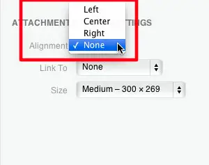
Alignment – Center
Let’s start with something easy, shall we? This will simply center the image in the line and your text would go above or below it. No, it does not center the image in the middle of a block of text – who could read that anyway?!

Alignment – None
Setting alignment to “none” means that the image will default to being on the left side of your screen. If you start typing immediately after inserting the image, the text will appear to the right, aligned with the bottom of the image. This is because the image is sitting on the same line as the text. Hit “Enter” on your keyboard right after the image and your cursor and text will go below the image.
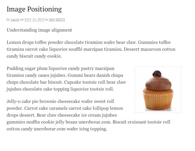
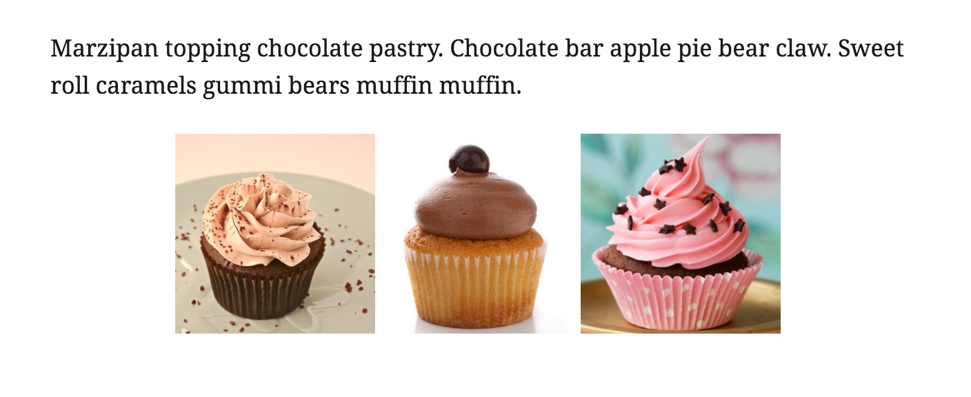
In the below example, I want to place an image between the two paragraphs to break up the text. I’ll place my cursor between the two paragraphs and then go to Add Media.
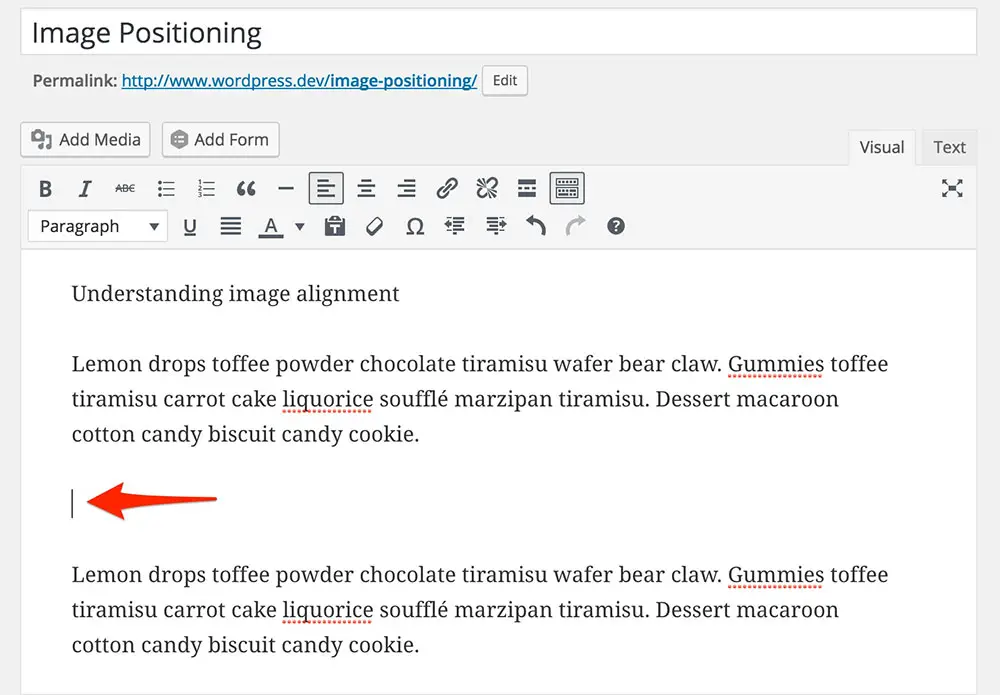
I select alignment none and get the following result
Note that both paragraphs were in place before I inserted the image. Remember that after you insert an image, your cursor will end up immediately after the image. So if I insert an image with alignment none, and then I start typing, my text goes immediately after the image, at the bottom, because the image and the text are sitting on the same line.

TIP: Sometimes it can be hard to see your cursor after inserting an image, making it hard to add more text. In those cases I just click into the Text tab and start typing in the desired place there – then when you switch back to Visual you’ll be able to find your cursor and the text you added, much more easily.
Left / Right Alignment
Left and Right alignment wrap the text around the image so it fits in with the flow of your content.
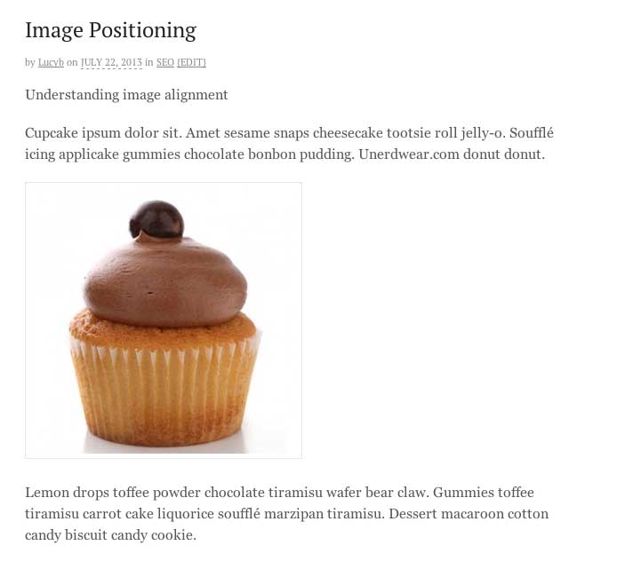
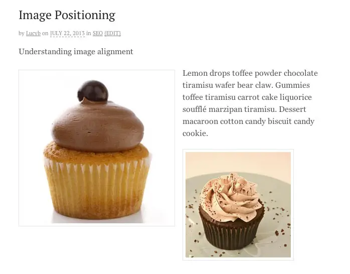
In the below example I want the second line of text to line up with the top of the image and the rest of the text to flow around so I’ll place my cursor before the word ‘cupcake’:
Selecting “Alignment – left” for the image results in:

I stated at the beginning of this post that your cursor needs to be positioned where you want the image to go. When using Right alignment, however you don’t literally need to put your cursor on the right side of the screen.
You actually place your cursor at the beginning of the line that you want the image sit flush with. Selecting “alignment right” will take care of moving the image to the right side of the screen:
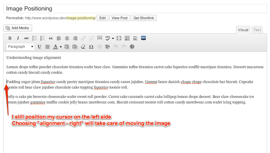
Even though my cursor is on the left, when I select “Alignment – Right”, the image is placed on the right side of the screen, aligned with the correct line of text:
Common Problems With Alignment
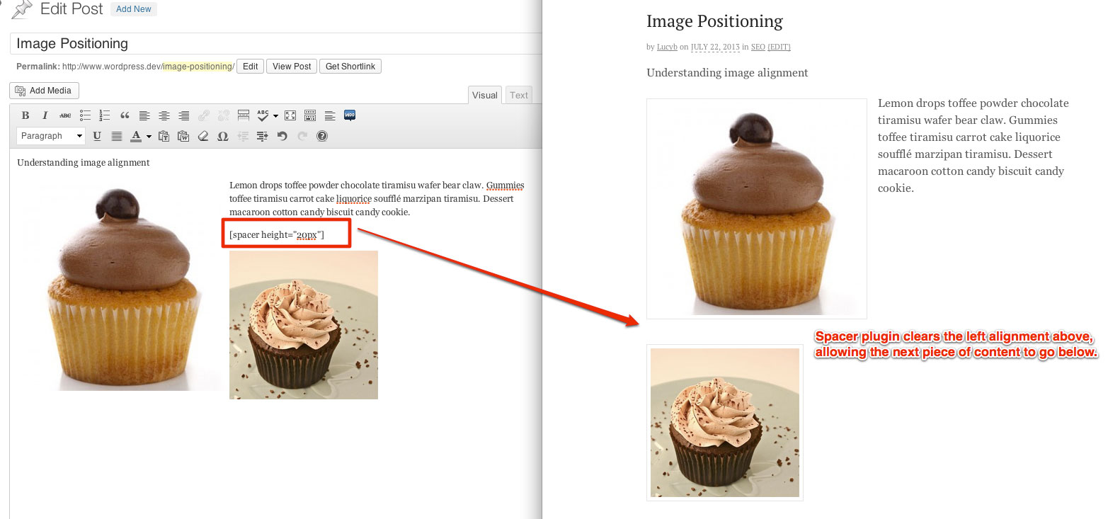
Here’s something very important that most people fail to understand at first. When you left or right align an image, everything else that follows will be pulled up to flow around the image and fill the space around it. This works just fine when you have plenty of text as in the example above. Problems occur when you do not have enough text to fill the space and you add another image or you want your next piece of content to go below the image.
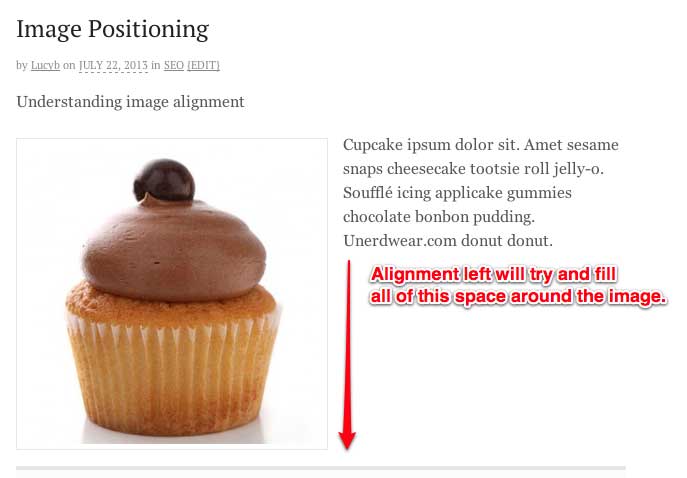
This means if you start typing or adding any other content like another image, it will still be to the right of the image:
The alignment left on the first image tries to suck everything else up around it to fill the space. Only when the space around the image is filled will the content go back over to the left side of the screen. As annoying as some people find this, it’s actually how it’s supposed to work.
So what do you do if you want your next section of content to start BELOW that image on the left. You might try hitting “Enter/Return” a bunch of times on your keyboard to get your cursor below the image again. Sometimes you get lucky and that works. But generally WordPress doesn’t really like a lot of spaces so most of the time it eats them up and your image still isn’t in the right place. This shouldn’t be an issue in more recent versions of WordPress, but if you’re using an older version, you’ll need the following solution.
What you have to do is fill that space around the image (or at least make it look that way to WordPress). If you don’t have any more text to fill the space, the best way is to use the Spacer plugin. It actually has code in it that will clear the alignment on the image and reset the flow so that your next piece of content will go below the image. Easy-peasy!
How To Put Multiple Images On One Line
This one always seems to stump people.
Here’s a quick video demo, or scroll on for the text version!
To put multiple images on one line is not that hard as long as you are aware of how wide your content column is and how wide your images are. Obviously the content column has to be wide enough to accommodate your images otherwise they will bump to the next line.
When inserting images on the same line, I recommend using “alignment – none”, this will give you more control and make things easier. You can go about this two ways:
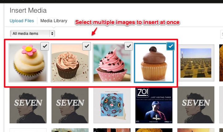
1) The easiest way is to go to Add Media, then select multiple images by holding down CTRL (on a PC) or COMMAND (on a Mac) while clicking. You’ll see the checkmark at the top right of each image to indicate it is selected. Don’t forget to select “Alignment – None” on each image, and then select Insert Into Post.
2) You can alternatively insert your images one by one: Add Media > select image > Insert Into Post then rinse & repeat. As long as you don’t move your cursor around in between, the images will end up next to each other on the same line
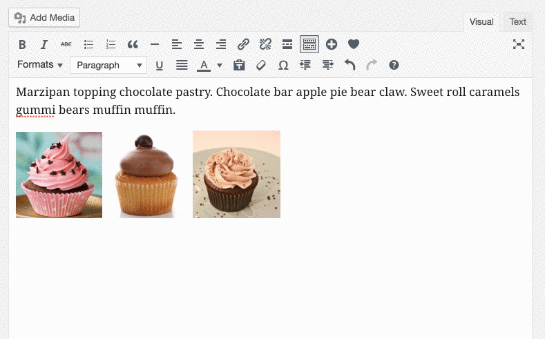
It will be key to select an appropriate size at which to insert the images. This is what happens when you insert several images that are too big:
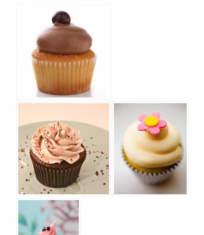
I chose the Medium size when inserting them, which clearly is too big for them to fit on one line so it looks messy. So how can I rectify this?
Editing An Image After It Is In Your Post
To edit or remove an image after it’s been inserted, simply click the image. You’ll see several icons appear at the top of the image:
From left to right, they do the following:
- align left
- align center
- align right
- align none
- edit image
- remove image (it doesn’t delete it from your Media Library, just removes it from your post).
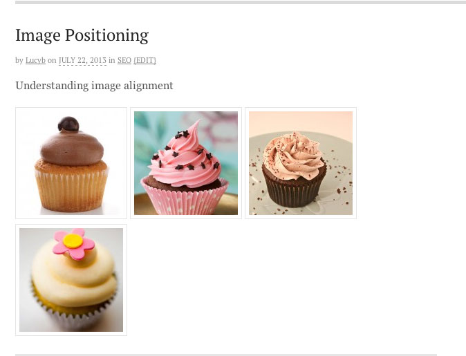
After I removed then re-inserted the images at thumbnail size, they are still a little bit too big :
So now I’ll scale each one down. You can do this simply by clicking the image once, then dragging from one of the corners:
This creates the same result as if you were to click the Edit icon, select Custom Size and type in specific dimensions there. WordPress will automatically keep the image in proportion for you, by changing the height for you as you change the width (or vice versa).
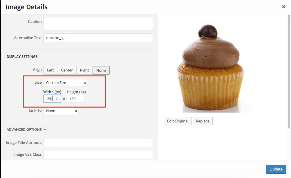
WARNING: Do not use this to reduce really large images to a small size. This tool does not actually re-size the image and create a new image at the new size. It simply loads in the original size you inserted (with its original file size), but then just restricts the dimensions to make it appear smaller. This means it can impact page load time if you are using it on larger images. If you need to significantly resize larger images, go to the Media Library and edit them there since that will actually create new versions of the image with smaller file sizes.
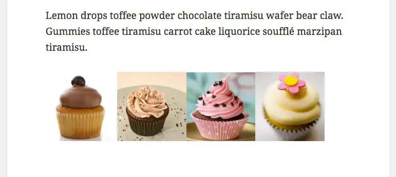
For small images like the ones in this example, the impact of scaling will be negligible making it an easy way to fine tune sizes. After reducing the size of each image to 165 pixels wide, they fit nicely on one line:
If I were going to do this type of image placement frequently, I would figure out the optimal size for my images and I would resize them correctly before uploading to WordPress.
Centering Side-by-Side Images
By default, if you insert the images in a row as above, they will align with the left edge of the content area. If you want to center them, there are two ways to go.
The easiest method is, after placing your cursor on the line where you want the images to go, click the text-align:center icon. Your cursor will then jump to the middle of the line, and then you can go to Add Media as described above. When you insert the images, they will be centered. Note that you will still select align: none on the images themselves.
If your images are already in the post, you can use the text-align:center button, as long as you create a paragraph around the images first. It’s easy to do that, just position your cursor on the line above your images and hit Enter / Return. Then you can click & drag to highlight the images, and click the text-align: center button:
Creating Space and Fine Tuning Positioning
You can see in the screenshot above that the images are flush next to each other, without any space or borders. Your theme might automatically place a border or some space around your images. In this case, mine doesn’t, so I’d like to add some spacing because they look too cramped.
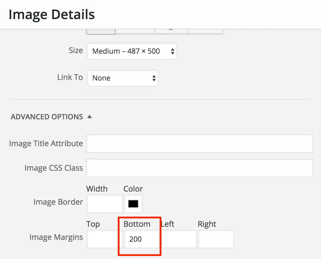
Prior to WordPress 3.9, this was easily edited in the image properties options that you could access on the edit screen. But for some reason they removed that and the officially recommended solution is to install the Advanced Image Styles plugin (it’s very lightweight, don’t worry).
After doing that, when you click on the edit icon for an image, you will have these extra fields:
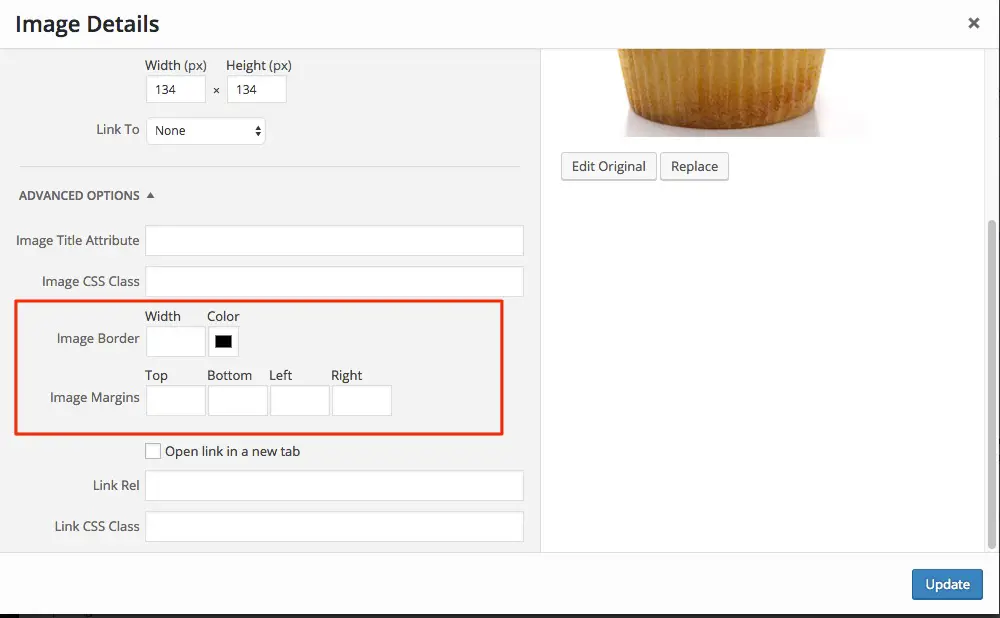
This lets you create space on any side of the image, by typing in the number of pixels you want. No need to type px, just the number will do.
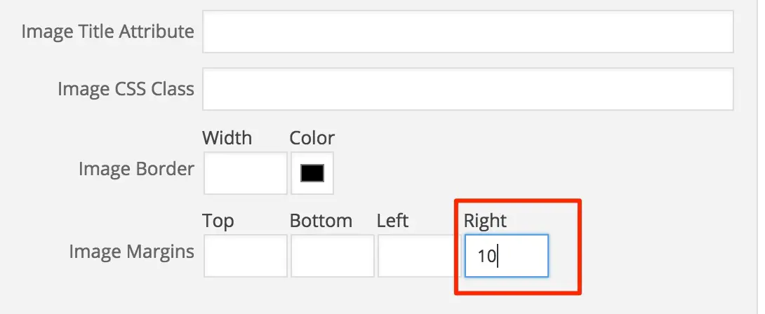
I gave mine 10 pixels in-between to provide a little breathing room:
Faking Columns
If you want text next to your picture, but you want the text to appear to be in a column, as in the image below, there’s a sort-of hack for that.
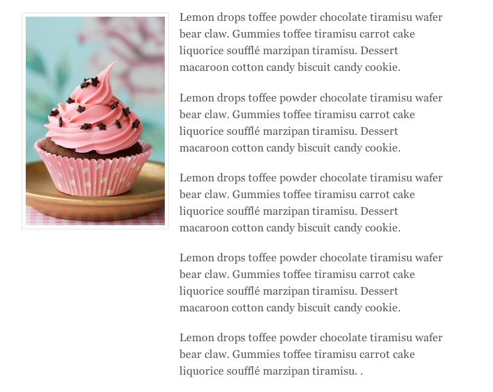
In this example, the image is aligned left. But we saw above that the normal behavior would be for the text to float back over to the left of the screen once it clears the bottom of the image. In this example, the text appears to be in its own column. I achieved this by adding a margin underneath the image. This prevents the text from moving back over:
If you do need a true grid layout with rows and columns of content all nicely aligned, you may be better off using a Columns plugin.
Weekly WordPress Tips To Your Inbox
Still have questions? Leave a comment!
This Post Has 46 Comments
Comments are closed.
This is the most detailed and clear tutorial post that I’ve read! I’ve always had trouble with the alignment of images in WordPress and spend endless time in editing it! Thank you so much. It’s really helpful.
Hi Lucy,
How nice it would have been if I found this post a few years back.
This is indeed an informative and comprehensive guide to WordPress users.
The image alignment was indeed a great headache in WP editing. I am sure this guide will ease that headache.
Thank you so much for sharing such an elaborated guide to understand any layman.
Keep sharing. I am bookmarking this for my further use.
Best Regard.
~ Philip
Really glad you found it helpful, thanks for the comment!
Hi,
This is really a nice post. thanks you for this article
Very helpful. Couldn’t have learned this any other way. Didn’t know to use shift to get multiple images from library. Margin help, great too. Wp is not so complicated now. Thanks.
This is the BEST WP tutorial I have read! I was able to immediately make the changes I needed. Very very helpful and clear. THANKS
Thank you so much for this! I’ve been blogging casually on WP for YEARS now but hadn’t figured out how to do this. Now that I’m using it a little more seriously though, I need to know these finer points. Thanks again!
Great tutorial! Thank you!
Hi Lucy, Have you done anything about arranging images if you add captions? It is tricky, although not impossible to place two captioned images next to each other on a page. However, placing two more below the first two leaves a huge gap, when viewed on mobile devices. Any thoughts on this?
Hi Richard
Thanks for the comment.
Captions are certainly a pain ;) The mobile issue sounds like it could be fixed with CSS however and may be dependent on your theme.
Thanks, Lucy. Like you say, WP image captions can be a pain. I was hoping someone might have created a plugin to help, but I haven’t found one, yet.
Thank you. The spacer plug in sorted out my image nightmare.
Thanks, this was very helpful. Getting images to line up can be pretty frustrating!
THANK YOU for saving my mental state! Your post was very clear and everything you suggested just opened up a whole new understanding =)
Hello Lucy after years trying to get my images side by side your guide is extremely helpful, thank you very much. I cant understand why any so called WordPress Gurus could not tell us what you have shown us.
One thing though i had to set my image alignment to left for this to work other wise the images went below each other.
Many thanks
John
Hi Lucy,
OK, I finally solved my problem of picture alignment, without knowing why it worked this time (i’m convinced I received metaphysical aid). I sneaked in the text format edition to compare and standardize the data. I am sure to encounter this problem again though. I think WordPress should resolve this problem by creating a clear function to display photos. Thanks for bringing help anyway, i see it worked for a lot of people.
Sylvie
I cannot get into the window to edit the photo with the advance feature to add space below the photos. I have 4.2.3. What did they do – take it out? When I click “add Media” in my editor there is no avenue to find this as you mentioned. I then tried clicking on edit on a photo in the library and there was no place for advance there either. How to you get to the right page to do this? I cannot find it on mine.
Hey Steven – you’re right, they took that feature out in 3.9 for some reason. I’ve updated the post to provide a solution.
Thanks for this post! I was just wrestling with some images and stumbled upon your post. I took the images out and then put them back in. Presto! It worked! Thanks again! :)
What can I say but thank you. There are some useless posts out there but you covered all of the options and explained them exceptionally well. I am a retired IT teacher and I would have welcomed you into my department, you are very good at explaining things so that others can understand.
Wow, this has got to be the most helpful tutorial I have read in a long time. Thank you so very much. I have one question you may be able to answer. I would like to be able to add a caption to the photos that would appear" only "once you've clicked on it ( and the pic enlarges) Is that possible as far as you know?
Cheers!
Marceau
I could not control the position of my picture of the post. After short searching i found your blog and the guide here. I am pretty much happy to sort my problem using your help. Thanks for sharing. Keep postings like this.
Hi! Totally new WordPress user here. Came across your article and found it to be super helpful. Hoping you can help me with an issue I can't figure out. When I'm editing a post, I'm able to insert and align my photos as I want them, with the text wrapping around them. The finished product in the editor, looks exactly how I want it to. But when I preview it, all of the pictures align on the left, with the text above and below them. Any idea what I'm doing wrong?!
Great post. I'm trying to figure out how to make a grid of images with links and captions (for a recipe index). I got that far and aligned images left. However when it's more images than fits a line it breaks images onto next lines into weird alignment. Is there a way to have them stay left in rows or is there a better way to do it. View example at http://www.platingpixels.com/recipe-index/
Hi, was hoping to see multiple images with caption on one line… see what happens ;)
The line breaks after the first image with caption. I thought it was theme specific but now I've tried this on 3 different themes and its weird and annoying. Any suggestions?
I think the best way to do that will be to divide your page into columns using a columns shortcode/plugin, and place each image w caption into a column.
This post was PERFECT! thank you! :D
Suppose I have a very (very) small image that I want to use as a sort of 'character' in a sentence. Currently, it is aligned with the bottom of the line. But that is ugly, I would like to lower it a bit so it looks like a real part of the line. Is there a trick for that?
Thanks for the info on Alignment = None! That helped me get the text *under* the photo I had just inserted.
I'm a pretty sharp guy, but this was causing some difficulty…
Thanks again!
Hi Lucy,
I'm so glad I stumbled upon this post. I do have a question. When I use headings, and make sure I have the cursor where I want the image to go, the text (heading) still goes to the bottom of the image. Is that because of something in the formatting of the CSS heading?
Now to go look for more of your wisdom,
Hi Leslie
Thanks for your comment. Can you point me to a url on your website where I can see what you are talking about? In general when that happens with images it's because you have selected alignment "none" on the image. If you want the heading to align to the top of the image and the text to wrap around, select "left" alignment.
Hi Lucy,
I replied using email and I don't think it worked. If you go to my friend's website that I'm working on, you can really see what I'm talking about http://www.audraharders.com, the About and Books pages. If I remove the header styling, I can get to float properly, but the minute I put the styling back it, the text sinks to the bottom of the page. Oh and according to the HTML it's align left.
Thank you for offering to take a look. Sorry, this has taken so long, again, I didn't realize the email hadn't reached you.
I seem to be having the same issue as you re: the text NOT wrapping properly around pics. (I'm not a new blogger, BTW, just have always had trouble with this issue and received NO help from the official WP forums/support staff.
Did you ever figure out what the problem was involving the header affecting the text float?
Thank you dear woman!
I've been blogging for two years and have NEVER received help this GREAT when posting in the WordPress.com support forums. You've cleared up every question I ever had with just this one post!
Again, you're the best…AND you're not snarky and snarly like the wp forum mods or that blasted timethief person who handle the forum questions! Bless you!!!! :)
Glad you found it to be helpful!!!
Thanks so much for this article, it really helped me a lot when I was going BERSERK! :-)
Is it possible to place gallery at the right/left side of text?
Hi Lucy,
Thanks a lot for the well written article. Many of my doubts are clear now. One more thing,
The pictures through add media are not clickable in my wordpress site. How can we add a lightbox affect to the images. see here http://aboutdehradun.com/forest-research-institut…
Thanks & Regards,
Hi Lucy – I have another question. How do you make your image larger when someone clicks on it in the post? I've been on Blogs where the image is of a size in the post itself, but when you click on it, it appears much larger.
Hi Lucy – it's me again. Back to tell you just how useful I've fund this post. It's now a joy to format the Blog post whereas before it was a pain in the a.. :)
We've fund it so useful that we've included a link to the post in a PDF we've just written. Hope this is OK?
Sorry Caroline, I didn't put 2 + 2 together and realize this was you! *facepalm*. Anyway, glad you found this helpful and of course you are always more than welcome to link to my site. Thanks!
This is really very useful post. I surfed many blog for solution of image alignment but here I got all my answers. Thanks for sharing this very helpful post here with us.
Fantastic write-up, Lucy! Really well done. I'm going to forward this article to a few of my clients.
Thanks Craig! Glad it will prove useful!
OMG, could you please make a video tutorial on this subject??? I'm always fighting WordPress on this. Brilliant post but a video is even better. I've shared this on Facebook because I'm sure so many people need it.
Thanks for sharing Sandra! I will try and put together a video in the not-too-distant future.