Create Custom WooCommerce Layouts with Beaver Builder

In this series about customizing WooCommerce product pages, Beaver Builder is the next tool we’re looking at. I previously wrote about PootlePress’ WooBuilder Blocks.
Beaver Builder is an established page builder plugin with its own interface which replaces the default WordPress editing screen. There’s a free version and a premium version along with numerous free and paid add-ons from various 3rd party developers.
Using the core Beaver Builder plugin you can choose to enable the builder for your Product pages, but word to the wise, this isn’t going to get you very far. In this mode the builder doesn’t fully take over the whole editing experience so you can’t actually change the product layout. I spent a fair amount of time beating my head against this wall before I found this guide. Keep that handy as you embark on this mission.
So the first thing you have to know is that you’ll need the Beaver Themer add-on as well if you really want to control your single product pages. This is where things start to get expensive since you’ll need to purchase the paid version of Beaver Builder in addition to the Themer add-on. This also increases the learning curve.
However, you will find that this combination of tools is pretty powerful, giving you control over almost all aspects of your WooCommerce store, and allowing for dynamic templating to achieve unique layouts.
These are the criteria in this series of posts to compare the various solutions:
- Reusable templates, applied in bulk
- Unique display of product images
- Ability to control and position each piece of product information independently.
Let’s see how Beaver Builder measures up.
Templating
Beaver Themer is essentially powered by the concept of templates, so this aspect is very powerful and more convenient than with WooBuilder Blocks, for example.
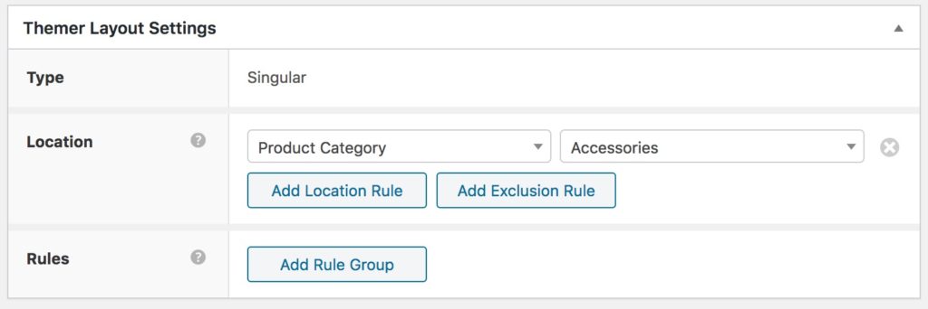
Beaver Themer allows you to create a custom layout for the various views of your store, e.g. the single product layout, the product category layout etc. After creating a layout you can apply your template with rules.
So with a couple of clicks you can decide to use the same layout for all your products, or you can apply a different layout for products in different categories. With a combination of conditions and rules you can be as general or fine-grained as you wish.

Another powerful feature of Beaver Builder is Field Connectors. This allows for dynamic templating by enabling you to populate content modules with information pulled automatically from a specified source. So instead of having to manually set that information on each specific page, it can be populated automatically and change based on each page.
Here’s a concrete example. In this series of posts, there are some specific layouts that I’m using as examples to try and re-create with each tool. As mentioned in the original post, one of them is this Bose headphones layout featuring a full-width hero image behind the product info:

It wasn’t possible to template this layout in WooBuilder Blocks because there was no way to dynamically populate the hero image with the main product image. It had to be set manually for each individual product.
However, using field connectors, it’s possible to template this in Beaver Builder because you can connect the background image to the featured image of a product, automatically:

This feature really opens up a lot of powerful possibilities.
Unique display of product images
Beaver Builder includes Gallery and Slideshow modules, each with a couple of different possible configurations. Both can be used with field connectors attached to WooCommerce product images. So this gives you some flexibility for your product images, out of the box.

However, thanks to the ecosystem of add-ons available for Beaver Builder, you can go further.
For example, PowerPack from WPBeaverAddons has field connectors so you can use their image carousel module to get a more polished-looking slideshow. Of course, you’re spending yet more money for that add-on.

One of the test layouts I’m using in this series is the following from Shinola Journals:

The trickier part of this layout would be the full-width product image carousel. This is possible with Beaver Builder. You could do it using their default slider module, or you could spring for an additional add-on like PowerPack to get an even more polished result.
Product details
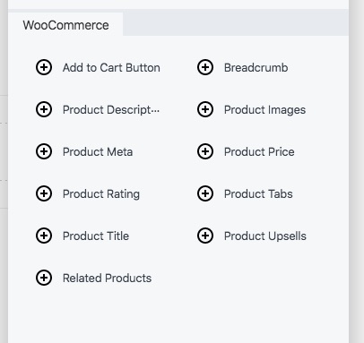
These are the WooCommerce modules available by default with Themer:

- Add to cart
- Breadcrumb
- Product description (includes choice of displaying short or full product description)
- Product images
- Product meta
- Product price
- Product rating
- Product tabs
- Product title
- Product upsells
- Related products
As you can see, this lets you control each item individually, and the ability to choose between the short or full product description is a good detail.
Can you do it with Beaver Builder?
The final test layout is the following from Rocky Mountain Soap:

The basic layout isn’t problematic, but the tricky part of this design is the custom product tab design.
You can use field connectors with the normal Beaver Builder tabs module, which does allow a choice between horizontal and vertical layout, but not all of the WooCommerce product elements seem to be available for display.
To truly achieve a vertical accordion layout along these lines you would again need an add-on. PowerPack has both an Advanced Tabs and an Advanced Accordion module. Either can be connected to WooCommerce product information and gives you a lot of control over how to display this information, including vertical or horizontal layouts.
In Conclusion
Compared to WooBuilder Blocks, Beaver Builder is a different type of product for a slightly different audience.
Going the Beaver Builder route to create only a few custom product pages would probably be overkill. WooBuilder would be a better choice there.
Beaver Builder is a more comprehensive and expensive product so it makes more sense to use it in cases where you can take advantage of more of its features. For example, with Beaver Builder you would be able to create custom layouts for most aspects of your store, like the category pages, not just individual product pages.
The templating is much more powerful making it a better choice for larger stores.
You could end up spending more money so I think it makes more sense for developers, site builders and owners of multiple projects, to get their money’s worth. Of course Beaver Builder is intended for more than just WooCommerce sites, so you can use it on all aspects of your site.
Beaver Builder has its own spin-off ecosystem at this point – Facebook groups, tons of 3rd party add-ons etc so you’re buying more than just a simple plugin. It’s a really well supported tool and there’s a huge value in that.
It does of course provide its own interface which is different than the classic WordPress interface or the block editor. So if you are particularly attached to those, you will have to make the mental shift. But once you get used to it, it’s quite easy to use Beaver Builder.
Beaver Builder is a good choice for:
- Developers and site builders who need full control over all layouts on a site.
- Those who aren’t afraid of a learning curve – if you have a lot of sites, it’ll be worth your time investment
- If you have a large store and need to easily apply layouts in bulk
Not recommended for:
- People that want to stick to the block editor
- Those on a budget – Beaver Builder could get a bit expensive
Price point
Plans start at $99 but the good thing is that even the lowest plan includes unlimited sites.

Beaver Themer is an additional $147.


