How To Customize Genesis Child Themes: Design Palette Pro
The Inner Beauty of Genesis
In the past, I’ve had mixed feelings about StudioPress’ Genesis framework. It was frequently recommended to beginners and non-developers, but the problem was that they would install it, and even with a nicely designed child theme, they would then complain, “but, where’s all the options?”
People immediately wanted to change things and when they didn’t see a massive options panel, they felt shortchanged. “I have to do CSS to customize this thing??”
But, herein lies the beauty of the Genesis framework. It’s not supposed to be Avada, Divi, X or any of the other “be everything to everyone” type of themes. When you purchase a Genesis child theme, you’re paying for the expertly-designed look and feel you see on the demo. They are not intended to be completely customizable by the user through an options panel. Of course, if you have the chops, you can certainly do anything you want with Genesis and its child themes, you just have to use their hooks system and know some CSS and PHP.
Some of you may be asking, “Well, where’s the beauty in that?”
Since working with WP Rocket (a premium caching plugin) I became painfully aware of just how badly some themes drag down a website’s load time. While researching a blog post to showcase some of our customers’ fastest pages, I found that most of the fastest sites I looked at ran on Genesis.
Because it doesn’t try to be everything to everyone, it’s really fast out of the box. And that’s the beauty.
“Yea, yea…..but…..customize! Fonts! Colors!” you may be grumbling at your screen.
Enter….Design Palette Pro
Ok, so if you must have those things, it is now possible to have the best of both worlds, courtesy of the nifty Genesis Design Palette Pro plugin. It is a premium plugin that’s well worth your pennies.
Design Palette Pro gives you a slew of options that you can use to customize your site’s design.
It’s lightweight and won’t slow you down. It’s really a dream for non-coders who want the benefits of Genesis’ stable codebase and performance, but also want to spruce things up a bit.
Let’s take a closer look at what you can do with Design Palette Pro.
On my test site I’m just running the basic Genesis child theme. If you are using a different child theme, check to make sure it’s supported in Design Palette Pro. This will ensure that you have control over features which may be specific to that particular child theme.
In essence, you can change the font, background colors and padding of each component of the theme, i.e. header, navigation, sidebar, footer, content area etc.
General Body
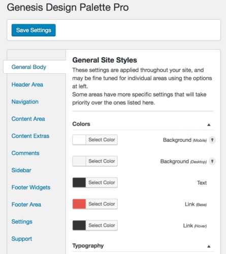
This is where you set up some defaults for your site that determine the overall color scheme/style you want – the background color of your site, default text and link color etc. There are more specific settings for different areas of your site where you can override these, but you should set these as a baseline.
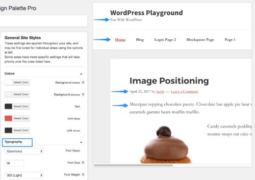
Selecting your font stack here changes the site tagline in the header, the navigation font, footer and the main body font. This helps you keep a consistent look throughout your site.
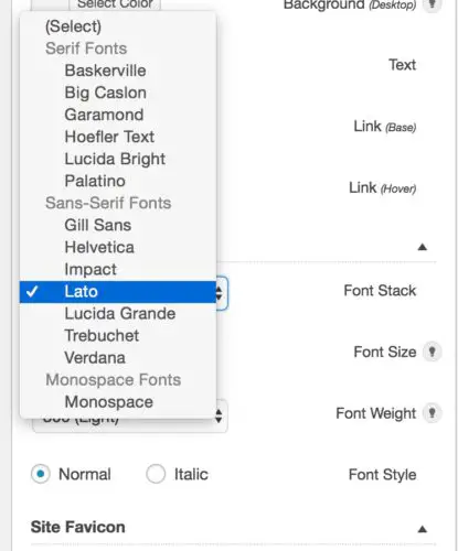
This is the font stack that you’ll have to choose from at the outset:
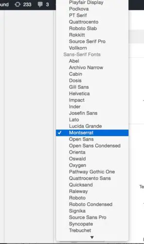
I know, you’re thinking it looks pretty stingy and limited, but there is an easy fix for that. There are several free add-ons available, including the Google Webfonts add-on which gives you a whole host of Google Fonts to choose from:
Using unique or well-paired fonts can really make your site stand out and create just the vibe you want. However, you do have to be careful. If you are not a designer, you’ll likely want to keep your font selections to a minimum. Don’t go crazy using different fonts in every section of your site otherwise it will end up looking like a ransom note. Adding too many Google fonts will also have an impact on performance. I wouldn’t recommend more than 2 fonts.
Header Area
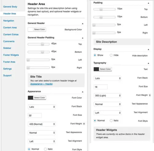
Here you can control the color, typography and padding of the header elements including site title, description and widgets (if you have any in the header area).
Navigation
The navigation settings are pretty comprehensive; you can control everything from background color to fonts, active items, hover styles, dropdowns etc.
As an exercise, I decide to see if I could mimic a different navigation style from another site.
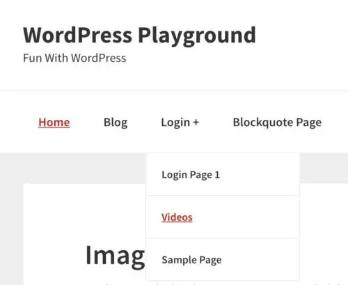
This is the default look/feel of the theme’s navigation right out of the box:
I’m not a designer, so I found something I wanted to copy. This is what I used as the model:
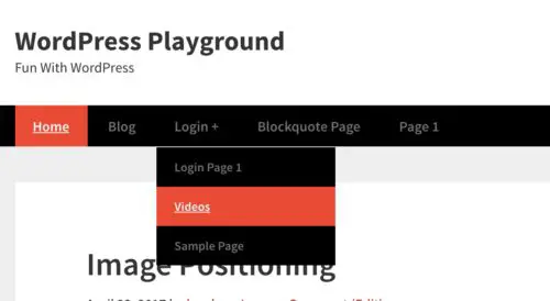
As you can see, I was able to get pretty dang near close:
Content Area
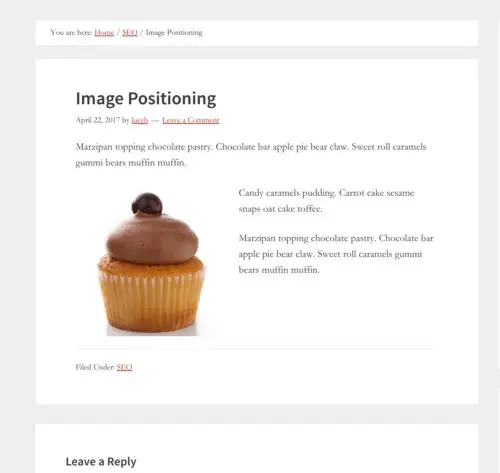
This refers to the main content in a post or page, basically this area:
You can control the padding and margins, i.e. the space in and outside of the content box, the typography & color for the title, entry content, meta info and post footer.
Content Extras & Comments
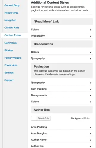
Content extras are those optional elements you may be using, like breadcrumbs, author boxes, pagination, and the “read more” link. Here you have control over the padding/margins, typography and colors of all those things.
Likewise, the comment options give you fine-grained control over every aspect of the display of comments.
All Things Widgets
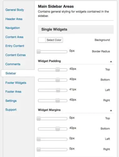
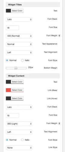
In the Sidebar and Footer sections you can control the look of your widgets:
Go Even Further With Add Ons
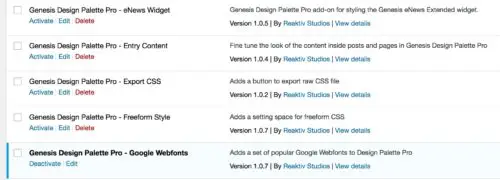
There are a handful of free add-ons available:
The Google Webfonts add-on is very useful, as mentioned earlier. Entry Content is another good one since it lets you control very specific items within your page/post content, such as styling for headers 1 – 6, paragraphs, links, lists, image captions, blockquotes etc. If you use the eNews Widget for email sign-ups, you’ll want the add-on for that. Freeform Style lets you add your own custom CSS if you’re so inclined.
What you can’t do with Design Palette Pro
This is a style customizer, not a layout customizer. So you shouldn’t expect to be able to make structural changes to the theme. That would be like building a house and then trying to change the floorplan after the fact. But you can paint and design what’s there, any way you like – this is what Design Palette Pro is for.
There isn’t necessarily an option for every little thing you might think of to change. For example, if you want to put a border around your sidebar widgets you can’t yet do that with an option. But for those types of tweaks, you can use the Freeform CSS add-on. And if you ask Design Palette Pro’s support team very nicely, they will likely give you a simple CSS snippet to paste in there. They are also receptive to adding more options if customers express a need.
Design Palette Pro makes Genesis and their child themes infinitely more user-friendly :)
Weekly WordPress Tips To Your Inbox






Thanks for the helpful article. I’m just experimenting with DPP in my new Author Pro theme (switched from Prose). One specific question – I can’t find a way to change the background color of the first item in my Secondary Navigation Menu – titled Home. It stays a different color than the rest if that menu, so I think there must be a separate place to customize it – but I can’t locate it! Thanks for any ideas.
Hi Kim
The background color stays the same no matter which page you are actually on? Do you have a URL to share so I can see it?
Cheers!