Learn How to Make Your Site More Inclusive with the Accessibility Checker Plugin

Accessibility is something that I’m really into… in theory. I believe everyone should have full access to the internet no matter what challenges they face or if they are using different devices to navigate and access the web.
But in reality I have not put as much work into this as I need to. So when I received the pitch email about the Accessibility Checker plugin, I thought it was a good opportunity to figure out just how badly I’m sucking at this, and find a starting point to try to address some of the issues.
I know from my work with speed optimization that an automated tool can’t do everything, and that one shouldn’t rely on any single tool for information about a site. But something is better than nothing and I figured this would be a good start.
First, I must disclose that I was given a free Pro license to test this plugin.
I did start with the free version of the plugin which is available in the WordPress.org repository. Just search for “accessibility checker”.
There’s not much in the way of settings to configure and I just left it at the defaults. So you can get started right away.
The welcome page has useful information for getting started, with
lots of links to help articles and a video.
But even if you ignore all the provided help, the plugin is easy to use. In the free version of the plugin, the action happens on the edit screen for your posts.
Scroll down and you will find the Accessibility Checker panel:
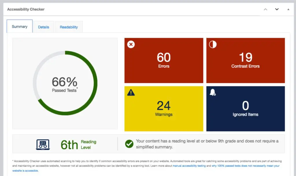
This gives you the “at a glance” overview on the accessibility status of your post.
Click on the “Details” tab to reveal the full report for your page:
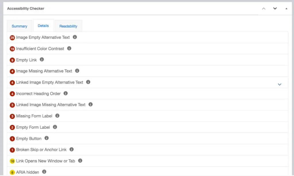
You get a list of problems with your page, with the specifics of what’s triggering the issue, and links to comprehensive documentation.

I found myself learning a ton from using this plugin. For example, I was not previously aware that accessibility standards require the reading level of content to be below 9th grade, or it requires a simplified summary.
I was really impressed with their documentation. It’s really thorough so you really get an education while you are using this plugin. Some site owners might be surprised to learn that some pieces of commonly shared web design wisdom may not always be the best for accessibility. A couple of examples:
- Alt text isn’t always necessary
- Opening some links in new tabs isn’t necessarily better for accessibility
This could be overwhelming for some site owners, but the documentation gives a lot of guidance for fixing the issues. In some cases, if you are not comfortable with CSS and HTML, or with customizing your theme, you may need to enlist the help of a developer to make some of the required tweaks.
Since it’s an automated tool, there are limitations. For example, you may have some images with empty alt tags. These will trigger a warning. But in some cases, depending on the context and purpose of the image, having an empty alt text may be the correct move for accessibility. So for those circumstances, you can use the “Ignore” button.
Some of the problems might be specific to the content of that post, such as missing or empty alt text on images. Others may be global problems affecting your whole site, such as insufficient color contrast on navigation or other links.
Pro version
You might be wondering, “do I have to run the checker manually page by page?”
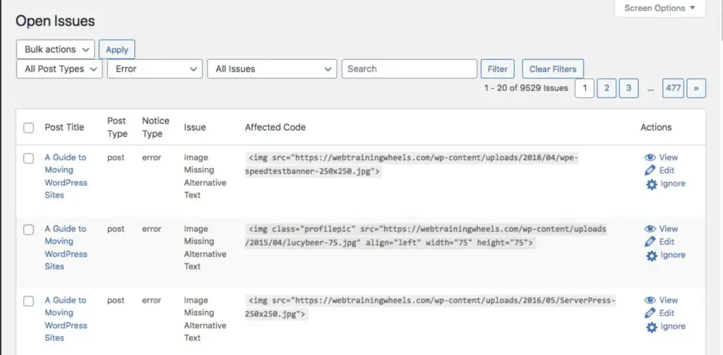
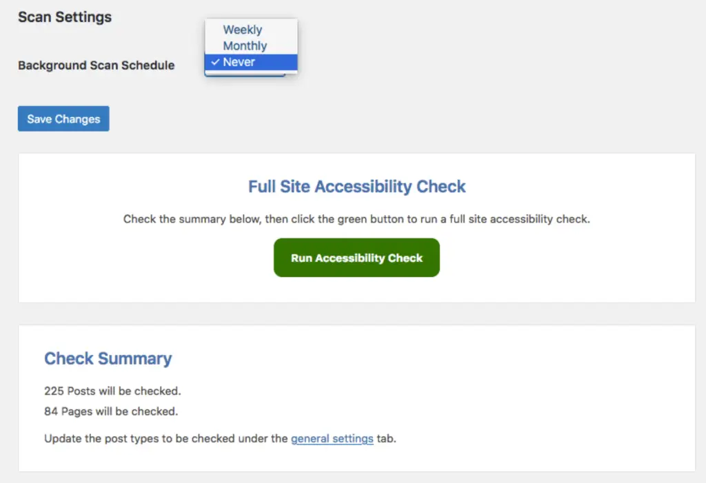
Indeed that would be quite a burden for a large site. That’s where the Pro version comes into play. The Pro version will run an automated full site scan and maintain a list of open issues that require attention.
How does it compare with other tools?
The results from the plugin gave me a lot of work on but since I know that you shouldn’t rely on one tool for everything, I decided to take the same post and run it through a couple of other tools to see how similar or otherwise, the results were.
The tools I used were:
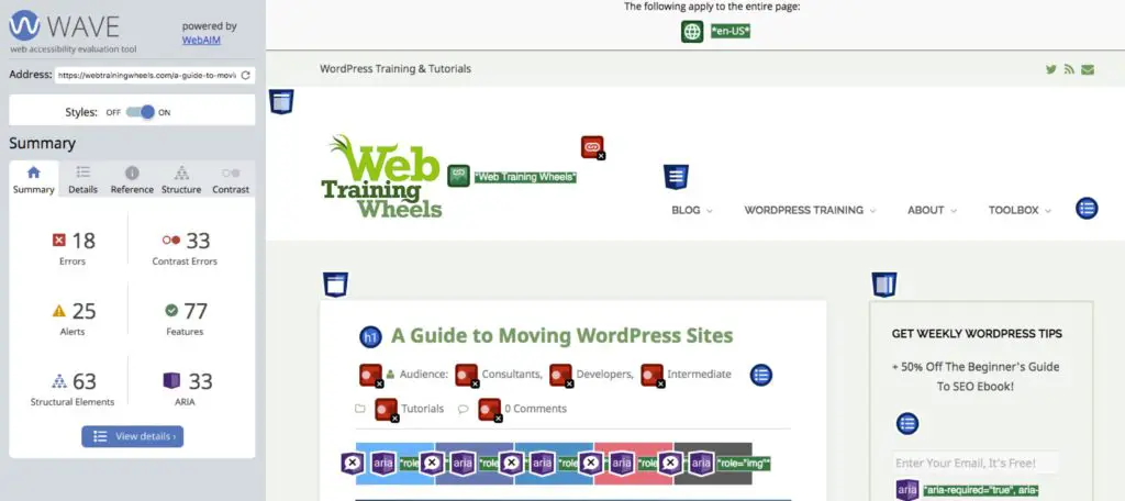
WAVE – Web Accessibility Evaluation Tool
You can go to this site, input your URL and get a visual report of the issues overlaid onto your page:
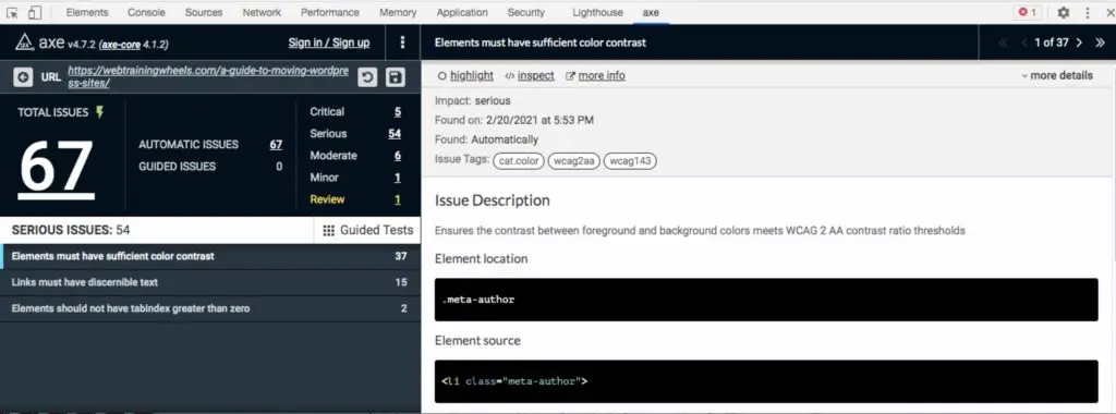
This tool runs in its own panel in the developer tools of Chrome:
All 3 tools did give me fairly similar results which was reassuring.
There were a few color contrast warnings that WAVE picked up which the plugin didn’t. I contacted Equalize Digital, the makers of Accessibility Checker, about this and it’s something they are working on. Since the tool works in a different way to WAVE there could be a couple of discrepancies.
I compared results between the tools on another site and they were all pretty much the same, so I feel pretty confident that the plugin is going to cover most of your bases.
Accessibility Checker is obviously a much more convenient solution for site owners than a separate external tool. I can see it being especially useful if you have a multi-author site, so that each writer can ensure their post adheres to accessibility standards, as they are writing it.
Accessibility isn’t just something you can fix in one place, or that you can “set and forget”. It could be affected by your theme, your plugins and your content. As the site owner, even if you fix global issues, you still have to make sure the content within each post is accessible.
Conclusion
I think Accessibility Checker a great tool to help site owners improve accessibility on their site and educate themselves in the process.
It’s not particularly cheap with a single site license being $149 per year. However that’s a lot cheaper than being sued. So for businesses it’s a worthwhile investment. By making your site more inclusive, you’re also ensuring that your message can reach an even wider audience.
If you’ve got a smaller site, the free version will be of great help.
After using this plugin I have a better understanding of the existing issues on my site, and a to-do list that I now must work through to address those issues one-by-one.
