WordPress 3.0 New Features – ‘Twenty Ten’ New Default Theme
WordPress 3.0 “Thelonious” has now been officially released (as you may have noticed from the upgrade prompt at the top of your WP dashboard).
I’ll be doing a couple of posts about the new features – in this one I’ll be discussing the brand new default theme that you’ll find if you upgrade.
New Default Theme – Twenty Ten
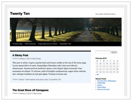
Here are some of the main new features that Twenty Ten demonstrates:
Easy Header and Background Customization
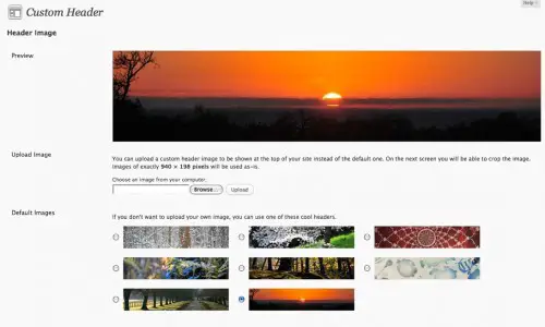
Appearance > Header
Twenty Ten comes pre-stocked with 8 header images from which to choose. You can also choose to upload your own image, either at the exact size of 940×198 pixels, or upload a different size and crop it, all within the WP admin. At last – simple, code-free branding for your site!
Appearance > Background
The background feature allows you to easily customize the background of your site. You can upload an image, which can be tiled or fixed and aligned as you choose, or you can select a solid background color.
Both these features will give beginners a much simpler way to give their site a more custom look, all without touching code.
Customize Header Per Post
You can set a different header image for an individual post or page by utilizing the “set featured image” option, which is included by default in Twenty Ten. You’ll find it on the Edit Post or Page screen, in the right-hand column underneath the Categories and Tags boxes. Click “set featured image” and you’ll see the familiar image upload pop-up. However, if you upload an image of 940×198 pixels, you can then choose the new “set as featured image” option, to create a new header for that particular post or page.
Custom Menus
Appearance > Menus
Perhaps the biggest and most significant (from a non-techy user point of view) is probably the new custom menus feature. No more worrying about how to mix and match categories and pages in your navigation bar, or trying to include links to other sites in navigation. Previously such tweaks required hacking code or at least using plugins – not any more. If you’ve ever used a Wootheme, you’ll be familiar with the custom menus system since it’s based on this popular Woothemes feature.
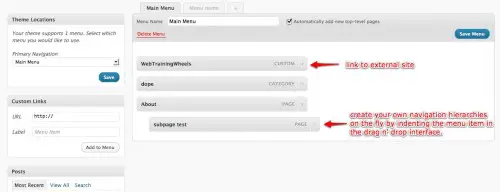
Now you can easily create a menu that includes pages, categories or other custom links by using a simple interface.
Twenty Ten offers space for one custom menu (horizontal beneath the header). But a theme may offer multiple menu areas in which case you could create a different navigation menu for each one which would give much more powerful and unique navigation possibilities. Support for custom menus has to be added to the theme, otherwise you can only add a custom menu as a sidebar widget, which is cool but less powerful.
Developers – read this guide to see how to utilize custom menus in your themes.
Another wonderful feature of custom menus allows you create dropdown menus that are no longer tied to page hierarchies. Any menu item can drop down from any other simply by indenting the item in the menu screen.
*Bonus tip – Click on Screen Options (top right of the page) to reveal some ‘hidden’ options such as the ability to include links to specific posts or tags giving you even more granular menu control! For developers, there is an option to add CSS classes to each menu item. Check out how Ivor Padilla used it to add a wee icon next to each menu item, which is a really nice touch.
Additional Widgetized Areas
Twenty Ten offers 6 widget areas giving you even more control over your theme right out of the box. There are 2 widget areas in the sidebar and 4 in the footer.
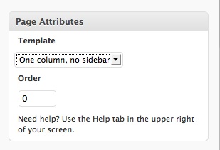
Extra Page Template
Gallery and Asides Post Styles
Another somewhat ‘secret’ feature is the in-built styles that have been provided when you set up categories called ‘gallery’ and ‘asides’. Simply creating categories with these names will activate the styles.
Taken from the Codex:
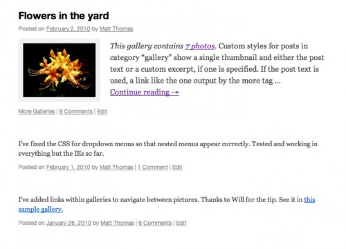
Twenty Ten includes special styles for posts that you file in the “Asides” or “Gallery” categories. When viewed on an index page (like your home page or a list of posts from a particular month), asides get a simplified look that seamlessly fit between full-length posts, while galleries give a peek at the photos that lie within. If you don’t already have those categories on your blog, just add them and start assigning posts to them. Twenty Ten will recognize the category name and start applying the correct styles automatically.
The image below shows the homepage display for a gallery post followed by two asides:
This covers what I have found so far to be the main features of the new default Twenty Ten theme, from a non-developer perspective. By providing such a full-featured and easy-to-use default theme, I imagine that it provides incentive for developers of themes such as Thesis, which are touted for being user-friendly, to step up their game a little bit and provide even more user-friendly options for their paying customers.

I dont see THE ONE COLUMN OPTION in my menu (have a free wordpress), I dont see Page Attributes drop-down, under the Publish box of the Edit Page screen. Could you tell me if I can achieve the one column or not.
Is this your site: http://gysphotos.wordpress.com/ ?
If so, you don't seem to be using the Twenty Ten theme, so this post wouldn't apply for you. The one-column template is a feature that the Twenty Ten provides. Other themes may also provide it – you would have to check their documentation. It doesn't sound like your particular theme provides any additional page templates :(
Great write-up Lucy! I came across another as well but that again was by you on examiner.com :)
Aloha Lucy, glad I had a chance to stumble onto your video clip and now I am here. I love your blog the way you arranged your blog, great set-up. I took your advise and now I am going to add a 2nd image to my header and see how that works. thanks for sharing! Lanikee.com
Hey Lani – glad you found me and are finding the site helpful!
I want to keep making pages, but they end up in the navigation bar up top! I dont want 100 pages showing up top in my menu? How in the world can I add and make pages without it going in the navigation bar?
Are you using WP 3.0? You can create a custom menu (go to Appearance > Menus) with only the pages you want in the navigation bar. If you are already using a custom menu, make sure to UN-check the box that says "automatically add new top-level pages".
I really like the new default theme for wp3, it's simple and easily customized. Thanks for the quick overview.
Thanks Greg! The header image on your blog is gorgeous!
In Twenty Ten – the parents of Categories aren’t showing up.
Hi, I'm used to being able to add pages and being able to link to them without adding each page to the NAV bar – like in Thesis. How do I do that in Twenty Ten?
Hi Kenny
Fortunately Twenty Ten is smarter than Thesis in this way ;)
When creating a custom menu, there is a checkbox called "Automatically add new top-level pages" – that should solve your problem….
I don't seem to be able to access the extra widget areas. They show on my screen, but there is no drop down or way to add anything.
?????
Hi Lorian
They should work just like the other widgets – just click the downward arrow on the right of the widget area, and then drag any widget you want into it.
If you are still having problems, drop me an email and try and attach a screenshot.
A little more info into the Gallery function would be nice. I've been looking everywhere for some information on how to use this feature and all I find is the standard explanation (like you have). I've created a Gallery category and attached one post to this to see how it works and it doesn't show any image. Obviously there's more to this than just "creating a Gallery category".
Hey Doug. Are you testing this specifically with the 'Twenty Ten' theme?
Helpful to see what's new. You did a great job walking us through it. My question for you is, if we're using the earlier version, is it going to throw us off kilter upgrading to the new one? Is it essential to save the current site somehow before upgrading?
Hey Julie
If you're referring to upgrading your WordPress installation to 3.0, then yes, you should back up everything before doing an upgrade – this is true any time you upgrade to a new WP version. Generally speaking, assuming your current theme is well-coded, it should still work just fine on WP3.0. Sometimes there may be plugins that have issues or incompatibilities.
But note that this post is discussing specifically the new default theme that comes with WP3.0 so unless you are going to change your theme to this one, it wouldn't really apply.
Some of the new features of WP3.0 are not automatically activated, so for example your current theme wouldn't support the custom menus feature right out of the box – there's a little coding needed to activate that function.
Let me know if you have more questions!
Hey Lucy,
Nice write up, I'm experimenting with 3.0 and Twenty Ten now:)
Thanks Adam! Lots of good info on your site too, I've been checking it out.
Cheers
Lucy